

Market Momentum: Your Weekly Financial Forecast & Market Prep
Issue 35 / What to expect March 03, 2025 thru March 07, 2025
In This Issue
Market-On-Close: All of last week’s market-moving news and macro context in under 5 minutes + futures-snapshots
The Latest Investor Sentiment Readings
Institutional Support & Resistance Levels For Major Indices: Exactly where to look for support and resistance this week in SPY, QQQ, IWM & DIA
Institutional Activity By Sector: Institutional order flow by sector including the top institutionally-backed names in those sectors. We break it all down and provide the key insights and take-aways you need to navigate institutional positioning this week.
Top Institutional Order Flow In Individual Names: All of the largest sweeps and blocks on lit exchanges and hidden dark pools
Investments In Focus: Bull vs Bear arguments for SPOT, ENPH, PDD
Top Institutionally-Backed Gainers & Losers: An explosive watchlist for day traders seeking high-volatility
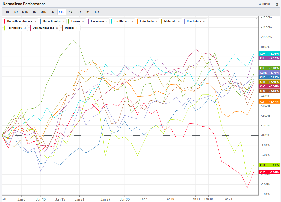
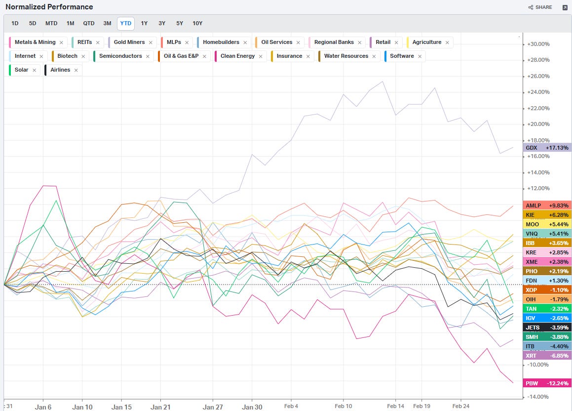
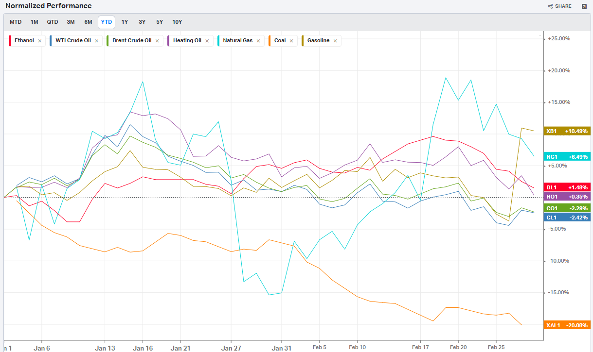
Normalized Performance By Thematics YTD (Sector, Industry, Factor, Energy, Metals, Currencies, and more): which corners of the markets are beating benchmarks, which ones are overlooked and which ones are over-crowded
Key Econ Events and Earnings On-Deck For This Week

Market-On-Close
The past week in U.S. financial markets was a whirlwind of economic data releases, geopolitical concerns, and shifting investor sentiment. Stock indexes exhibited significant volatility, swinging between gains and losses before closing the week with modest recoveries. Inflation remained a focal point, with the Fed’s preferred gauge—the core Personal Consumption Expenditures (PCE) index—matching expectations but doing little to dispel uncertainty about future monetary policy. Meanwhile, bond yields fell to multi-month lows, reflecting a complex interplay of economic slowing, policy uncertainty, and investor risk aversion.
Markets React to Inflation Data and Growth Concerns
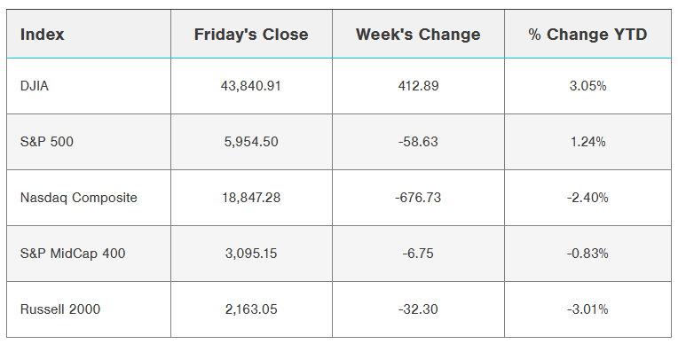
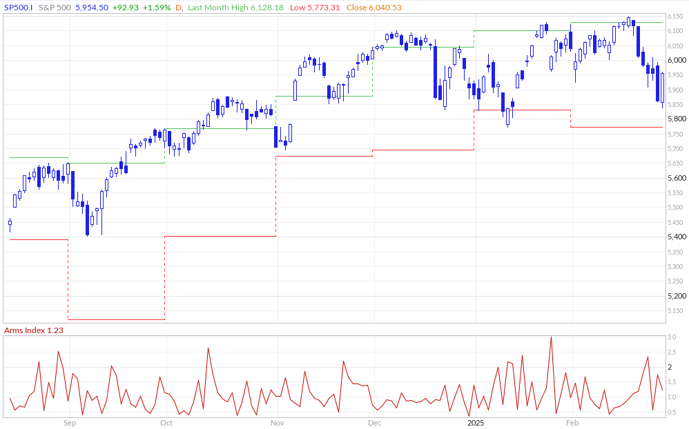
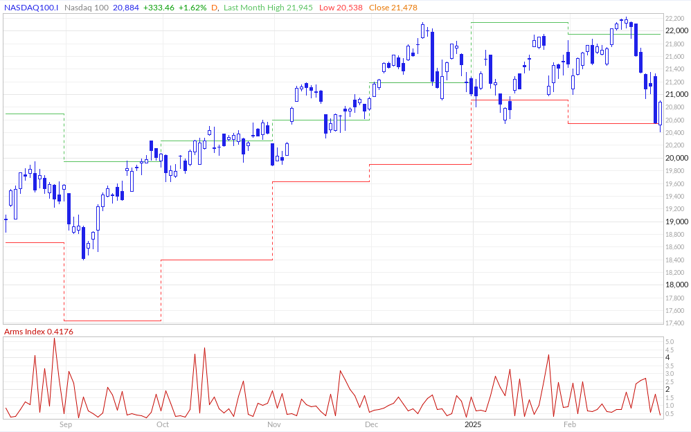
The S&P 500, Dow Jones Industrial Average, and Nasdaq 100 all ended the week higher after enduring turbulence. On Friday, the S&P 500 ($SPX) climbed 1.59%, the Dow Jones ($DOWI) gained 1.39%, and the Nasdaq 100 ($IUXX) advanced 1.62%. Futures markets also reflected optimism, with March E-mini S&P futures (ESH25) up 1.45% and March E-mini Nasdaq futures (NQH25) rising 1.47%.
Much of the relief rally stemmed from January’s core PCE data, which came in at 2.6% year-over-year—the lowest annualized increase in nearly four years. Investors viewed the data as an indication that the Federal Reserve may be on track to cut interest rates later this year, a sentiment further bolstered by declining Treasury yields. The benchmark 10-year T-note yield dropped to a 2.5-month low, providing support to equities.
However, the week was anything but smooth. A surprise decline in U.S. personal spending for January, down 0.2% month-over-month, raised concerns about consumer resilience. While personal income increased by 0.9%—the biggest jump in a year—the decline in spending suggested that Americans may be tightening their wallets in response to inflationary pressures and economic uncertainty.
Adding to the week’s drama, a meeting between former President Trump and Ukrainian President Zelensky was abruptly canceled due to disagreements, rekindling geopolitical tensions. Markets briefly turned lower on the news, highlighting how fragile sentiment remains.
Tariff Fears Resurface
Trade policy once again entered the spotlight as President Trump announced plans to impose 25% tariffs on Canada and Mexico starting March 4, along with an additional 10% tariff on China. Investors reacted negatively to the news, fearing that escalating trade barriers could weigh on global supply chains and corporate profit margins. Given that the previous round of tariffs during Trump’s first administration had far-reaching effects on markets, this latest announcement added another layer of uncertainty to an already jittery environment.
Tech Sector Struggles and a Shift in Market Leadership
One of the most notable themes of the past week was the underperformance of the so-called Magnificent 7—mega-cap tech stocks that have led the market higher over the past two years. With six of the seven companies lagging the broader market, their leadership appears to be waning. NVIDIA, widely regarded as a bellwether for artificial intelligence (AI), reported stellar earnings with a 78% revenue jump year-over-year, but its stock fell 8.5% as investors deemed the results as merely "good" rather than "extraordinary."

The sharp pullback in big tech has led to a broadening of market leadership, with sectors like health care, financials, and consumer staples showing relative strength. The S&P 500 Equal Weight Index (SPXEW), which assigns equal weighting to all index components, is up over 1% year-to-date, while the market-cap weighted S&P 500 has been flat.
Sentiment Takes a Hit
Investor and consumer sentiment soured further last week, reflecting heightened uncertainty around economic growth and inflation. The Conference Board’s Consumer Confidence Index for February dropped to 98.3, marking its sharpest monthly decline since August 2021.

Perhaps more concerning was the index’s expectations component, which fell below 80—a level historically associated with recessionary conditions. Inflation expectations also ticked higher, with survey respondents forecasting 6% price increases over the next year, up from 5.2% in January.

Bond Market Signals and Treasury Yields
While stocks wavered, the bond market painted a picture of growing economic caution. The 10-year Treasury yield fell to 4.19%, its lowest level in nearly three months, reflecting strong demand for safe-haven assets. The yield curve inversion between the 10-year and 3-month Treasuries—a closely watched recession indicator—deepened further, raising concerns about slowing growth.
Bitcoin and the Crypto Market Selloff
The crypto market was not immune to the week’s turbulence. Bitcoin tumbled 12% to $84,500, extending its February decline to 18%. The slide was driven by a combination of profit-taking, increased regulatory scrutiny, and broader risk-off sentiment in financial markets.
Earnings Scorecard: A Silver Lining?
Despite macroeconomic headwinds, corporate earnings continued to impress. With 95% of S&P 500 companies having reported Q4 results, aggregate earnings grew by 18%—the highest rate in three years. The financial sector led the charge with a 56% earnings gain, while other sectors such as industrials and consumer staples also delivered strong results. This earnings resilience suggests that, despite near-term market volatility, corporate America remains in good shape.
Looking Ahead: Volatility Likely to Persist
As markets head into March, several key questions remain unresolved:
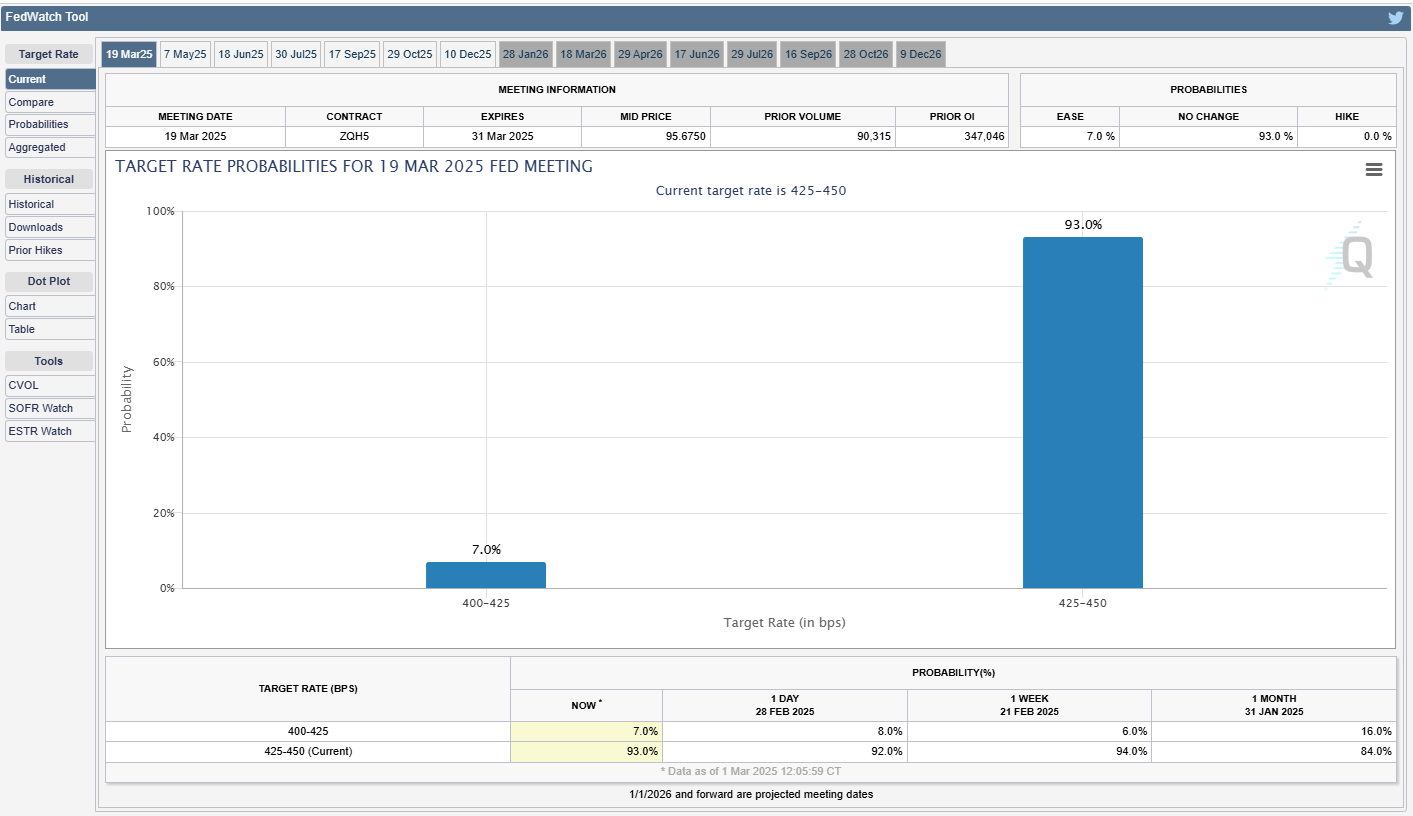
Will the Fed cut rates in 2025? Market pricing currently assigns only a 7% chance of a 25-basis-point cut at the next FOMC meeting, but expectations could shift if inflation continues to ease.
How will trade policy evolve under the Trump administration? The threat of tariffs remains a wildcard that could disrupt supply chains and dampen investor confidence.
Can the Magnificent 7 regain their leadership role? Or will markets continue to broaden out toward cyclical and value stocks?
Market history suggests that periods of volatility and sector rotation are normal components of long-term investing. While a correction of 10% or more has not occurred in over a year, the S&P 500’s sideways movement over the past three months may be acting as a stabilizing force. Investors who focus on balance and diversification may be better positioned to weather near-term market fluctuations while capturing long-term opportunities.
For now, uncertainty remains the dominant theme. But with inflation slowly easing, corporate earnings proving resilient, and monetary policy likely to remain accommodative, there are reasons to believe that the bull market still has room to run. The key, as always, will be navigating the noise and maintaining a disciplined, long-term investment approach.
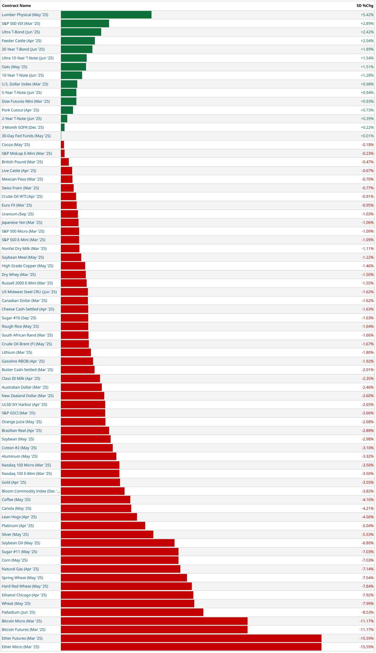
5-Day Futures Performance Leaders
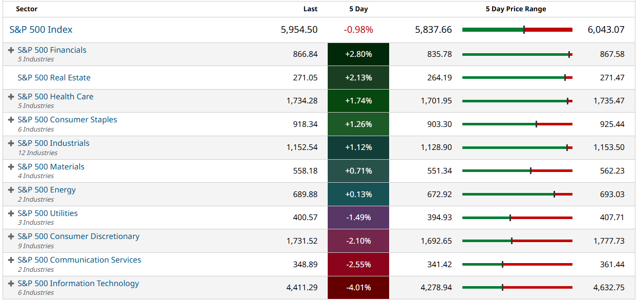
S&P 500 Sector Insights
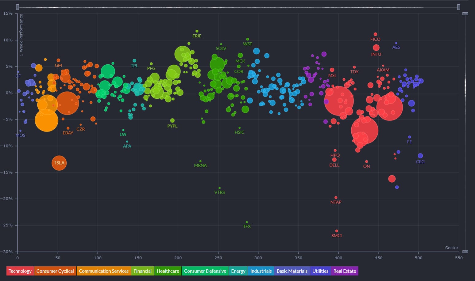
Sector Overview With Individual Names By Market Cap
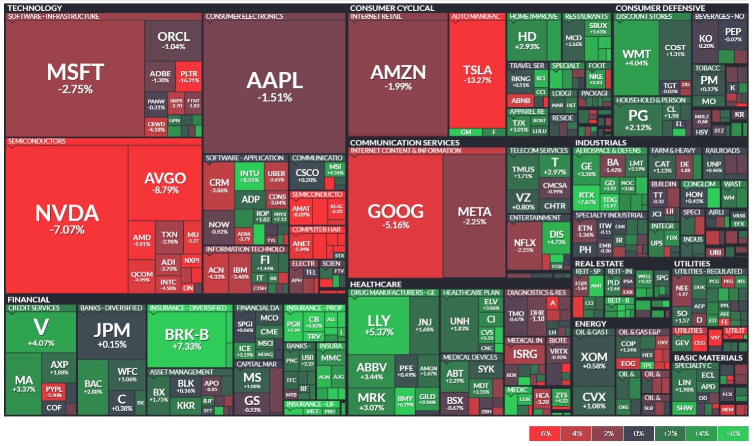
Sharp Tech Sector Weakness: Technology stocks are experiencing significant declines, particularly in semiconductors with NVDA (-7.07%) and AVGO (-8.79%) showing substantial losses. Other major tech names like MSFT (-2.75%), AAPL (-1.51%), GOOG (-5.16%), and META (-2.25%) are also negative.
Extreme Tesla Decline: TSLA shows a dramatic -13.27% drop, significantly underperforming even other negative sectors, suggesting company-specific issues beyond general market trends.
Financial Sector Strength: Financial stocks are displaying remarkable resilience with Berkshire Hathaway (BRK-B +7.33%), Visa (V +4.07%), and Mastercard (MA +3.37%) leading the gains. This indicates a potential sector rotation from growth to value.
Healthcare Outperformance: Pharmaceutical companies like Eli Lilly (LLY +5.37%), Merck (MRK +3.07%), and AbbVie (ABBV +3.44%) are showing strong positive returns, reinforcing a shift toward defensive sectors.
Consumer Defensive Strength: Companies like Walmart (WMT +4.04%), Procter & Gamble (PG +2.12%), and Home Depot (HD +2.93%) are performing well, further confirming the rotation to defensive and value-oriented names.
Industrials Mixed Performance: This sector shows a mix of gains and losses with some aerospace & defense names like RTX (+7.07%) performing exceptionally well.
Energy Stocks Resilient: Most energy names are holding up relatively well despite recent commodity price volatility, with companies like XOM (+0.88%) in positive territory.
Clear Risk-Off Sentiment: The overall pattern shows investors moving away from high-growth, high-valuation technology stocks toward more stable, dividend-paying sectors like financials, healthcare, consumer staples, and utilities.
Magnitude of Divergence: The stark contrast between the worst performers (deep red in tech) and best performers (bright green in financials/healthcare) suggests an unusually strong rotation.
Market Breadth Concerns: While indexes may show modest declines, this heatmap reveals significant underlying weakness in large-cap tech names that have been market leaders, potentially signaling a shift in market leadership.
5-Day Sector Leaderboard
5-Day Individual Performance Grouped By Sector (Size By Market Cap)
ETF Insights
Reviewing a heatmap like this weekly can be incredibly helpful for investors as it provides a quick and visual summary of market performance across various sectors, asset classes, and geographies.
1. Sector and Asset Class Trends
Identify Strong and Weak Sectors: Investors can quickly spot which sectors (e.g., technology, energy, healthcare) are performing well or underperforming.
Asset Class Diversification: Seeing how commodities, fixed income, equities, and cryptocurrencies performed helps assess diversification.
2. Market Sentiment
Risk-On or Risk-Off: A green-dominated map suggests bullish sentiment, while red indicates bearish sentiment. Investors can align their strategies accordingly.
Volatility Indicators: Observing movements in volatility indices (e.g., VIX) can highlight changing market dynamics.
3. Regional Analysis
Global Insights: Performance in developed and emerging markets (e.g., Europe, China, Asia-Pacific) helps in gauging international investment opportunities or risks.
Currency Impacts: Movements in forex or country-specific ETFs can indicate currency-driven market trends.
4. Thematic Trends
Growth vs. Value: Comparing the performance of growth ETFs (e.g., VUG) versus value ETFs (e.g., VTV) reveals the prevailing market preference.
Industry Leadership: Highlighting leadership within industries (e.g., gold miners, semiconductors) can inform thematic plays.
5. Monitoring Investments
Portfolio Alignment: Investors can track how their existing investments or watchlist align with broader market trends.
Rotation Signals: Seeing week-over-week changes in sector dominance may signal sector rotation opportunities.
6. Risk Management
Recognizing Overbought/Oversold Conditions: Consistent underperformance or overperformance in specific areas may indicate potential mean-reversion trades.
Correlation Awareness: By observing how different asset classes move, investors can manage portfolio correlation and risk.
7. Decision Support
Identify Outperformers/Underperformers: ETFs, sectors, or indices that repeatedly outperform or underperform can help refine trading or investment strategies.
Macro Perspective: Weekly trends highlight macroeconomic or geopolitical influences affecting markets.
Regularly reviewing a heatmap like this is a strategic practice that supports data-driven decision-making while fostering a holistic understanding of market dynamics.
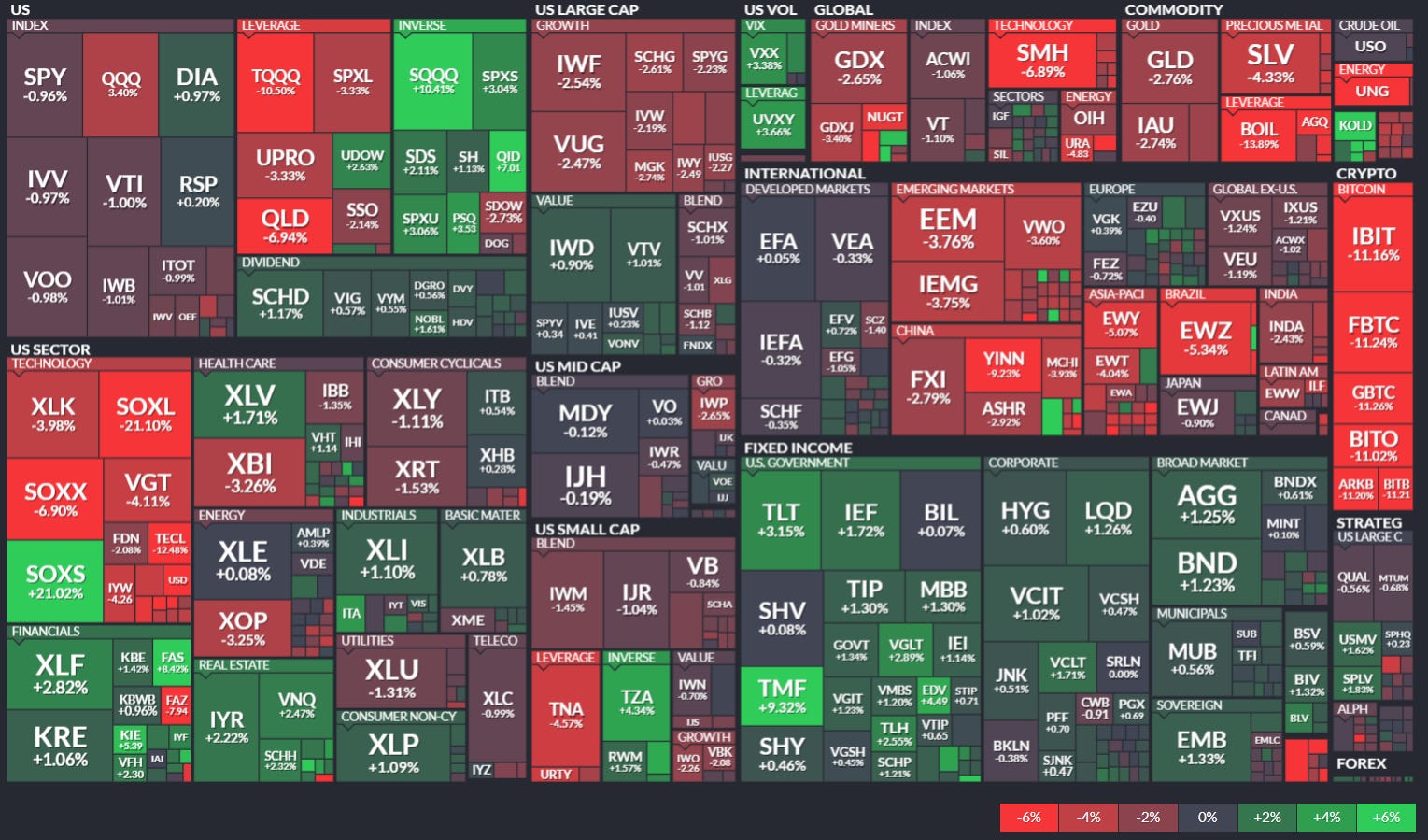
Technology sector is experiencing significant pressure, with major tech ETFs showing substantial losses:
SMH (Semiconductor ETF): -6.89%
XLK (Technology Select Sector): -3.98%
SOXX (iShares Semiconductor): -6.90%
SOXL (Leveraged Semiconductor): -21.10%
Fixed Income and Bonds are performing well, providing a safe haven:
TLT (Long-Term Treasury): +3.15%
IEF (7-10 Year Treasury): +1.72%
BND (Total Bond Market): +1.23%
AGG (Aggregate Bond): +1.25%
Financial sector shows resilience amid market volatility:
XLF (Financial Select Sector): +2.82%
SOxs (Direxion Financial Bull): +21.02%
KRE (Regional Banks): +1.06%
Real Estate and Utilities are performing relatively well:
VNQ (Vanguard Real Estate): +2.72%
IYR (iShares Real Estate): +2.22%
XLU (Utilities Select Sector): +1.31%
Commodity-related ETFs are broadly negative:
GLD (Gold): -2.76%
SLV (Silver): -4.93%
USO (Crude Oil): -13.07%
UNG (Natural Gas): -9.80%
Cryptocurrency ETFs show significant losses:
IBIT (Bitcoin ETF): -11.16%
FBTC (Fidelity Bitcoin): -11.24%
BITO (ProShares Bitcoin): -11.02%
Global and emerging markets are struggling:
EEM (Emerging Markets): -3.76%
EWZ (Brazil): -5.34%
YINN (China Bull 3X): -9.23%
FXI (China Large-Cap): -2.79%
Healthcare sector is outperforming technology:
XLV (Healthcare Select Sector): +1.71%
Inverse ETFs are positive, reflecting market declines:
SQQQ (Inverse NASDAQ): +10.41%
SDS (UltraShort S&P 500): +2.11%
Major index ETFs show modest losses:
SPY (S&P 500): -0.96%
QQQ (NASDAQ): -3.40%
IWM (Russell 2000): -1.65%
Global Overview
Foreign ADR stocks listed on NYSE, NASDAQ & AMEX categorized by geographic location. Reviewing a global heatmap like this weekly is valuable for investors because it offers insights into international markets, helping to:
Identify Global Trends: Spot which regions or countries are performing well or underperforming.
Assess Sector and Regional Performance: Understand how industries are faring across different regions.
Diversify Portfolios: Uncover opportunities in emerging or developed markets for greater diversification.
Gauge Global Sentiment: Recognize the impact of macroeconomic events on specific regions.
Align with Global Strategies: Refine investment strategies based on regional strengths or weaknesses.
This overview ensures investors stay informed about global opportunities and risks, complementing their domestic market analysis.
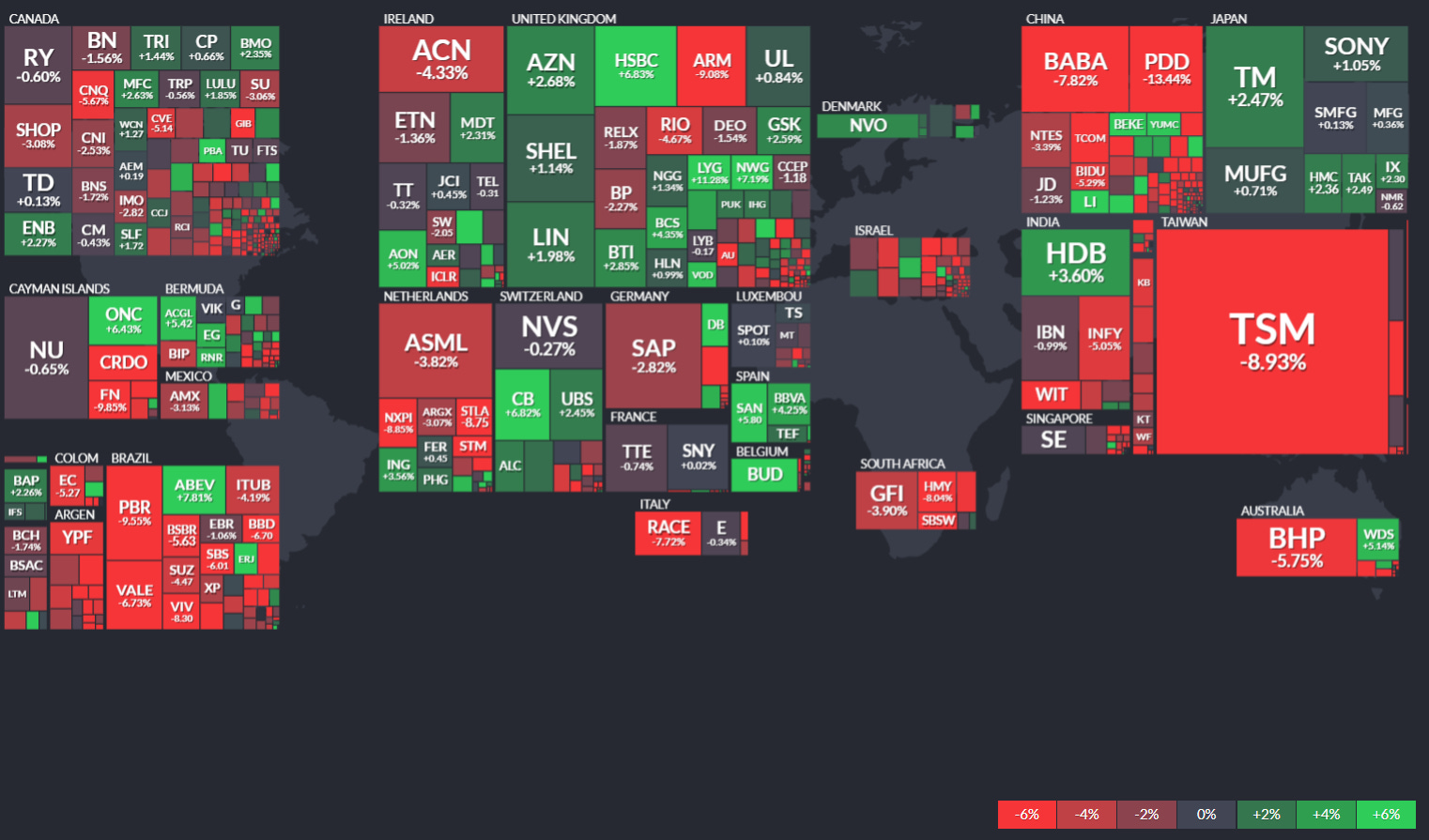
Asia, particularly Taiwan, is experiencing significant downward pressure, with TSM (Taiwan Semiconductor Manufacturing) showing a substantial decline of -8.93%. This is notable as TSM has a large market cap indicated by its box size.
The technology sector appears to be under pressure globally, with companies like ASML (-3.82%) in the Netherlands, and Chinese tech firms like BABA (Alibaba, -7.82%) and PDD (PinDuoDuo, -13.44%) showing significant losses.
There's a clear regional pattern in Europe, where companies are showing mixed but generally modest performance, with more balanced distribution between gains and losses.
Japan seems to be performing relatively better than China, with companies like SONY (+1.05%) and MUFG (+0.71%) in positive territory.
In South America, commodity-focused companies like VALE (-6.73%) in Brazil are showing notable declines.
The Australian market is dominated by BHP (-5.75%), suggesting resource stocks may be under pressure.
The financial sector shows mixed results across regions, with some banks like UBS (+2.43%) performing positively while others struggle.
The largest market cap losses appear concentrated in semiconductors and tech, particularly in Asia (TSM, ASML).
Green spots (positive performers) are more evenly distributed across regions but generally represent smaller market caps than some of the notable red boxes.
North American companies shown (Canadian and some US-listed ADRs) display mixed but somewhat more positive performance compared to Asian counterparts.

US Investor Sentiment
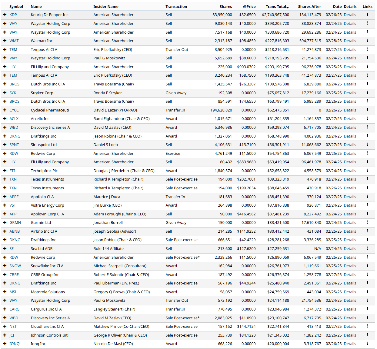
Insider Trading
Insider trading occurs when a company’s leaders or major shareholders trade stock based on non-public information. Tracking these trades can reveal insider expectations about the company’s future. For example, large purchases before an earnings report or drug trial results might indicate confidence in upcoming good news.
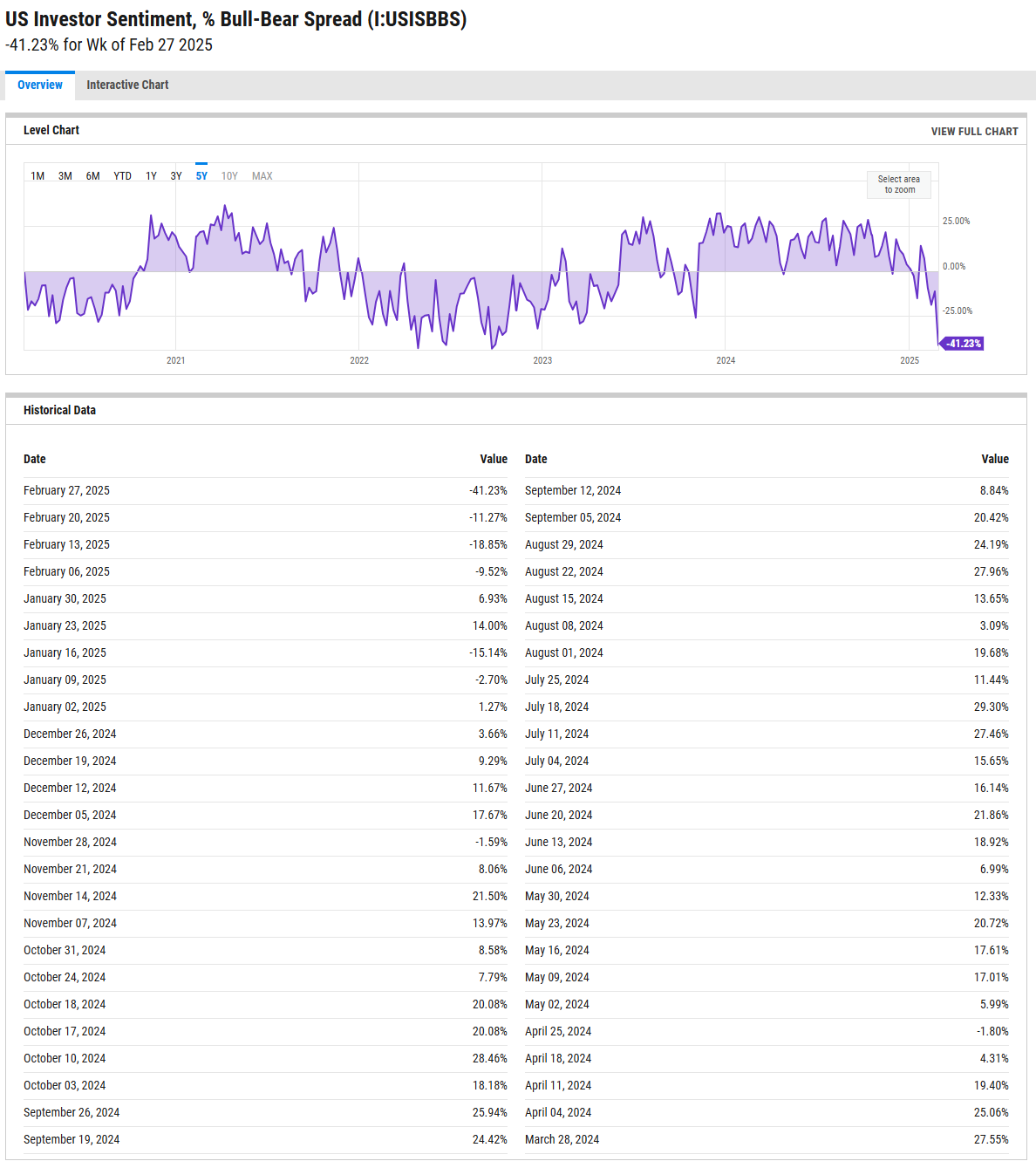
%Bull-Bear Spread
The %Bull-Bear Spread chart is a sentiment indicator that shows the difference between the percentage of bullish and bearish investors, often derived from surveys or sentiment data, such as the AAII (American Association of Individual Investors) sentiment survey. This spread tells investors about the prevailing mood in the market and can provide insights into market extremes and potential turning points.
Bullish or Bearish Sentiment:
When the spread is positive, it means more investors are bullish than bearish, indicating optimism about the market’s direction.
A negative spread indicates more bearish sentiment, meaning more investors expect the market to decline.
Contrarian Indicator:
The %Bull-Bear Spread is often used as a contrarian indicator. For example, extremely high levels of bullish sentiment might suggest that the market is overly optimistic and could be due for a correction.
Similarly, when bearish sentiment is extremely high, it might indicate that the market is overly pessimistic, and a rally could be on the horizon.
Market Extremes and Reversals:
Historically, extreme values of the spread (both positive and negative) can signal turning points in the market. A very high positive spread can signal market exuberance, while a very low or negative spread may indicate fear or capitulation.
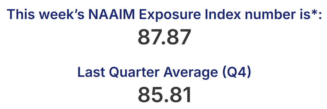
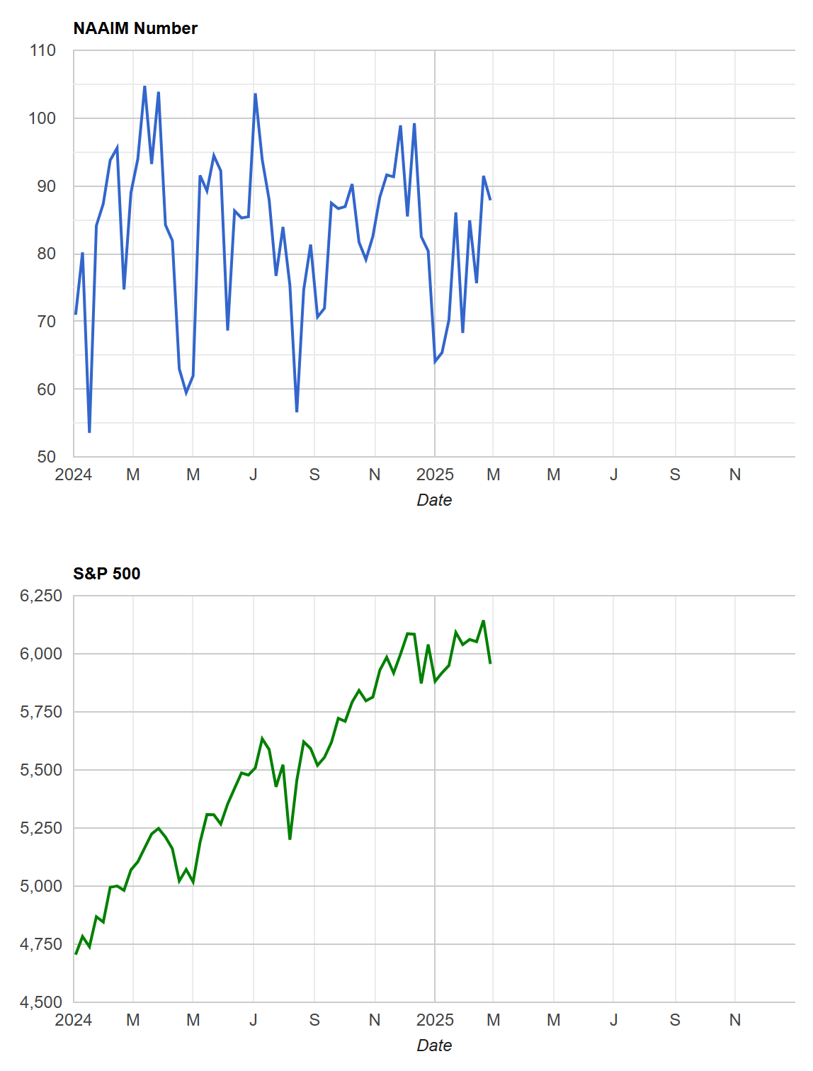
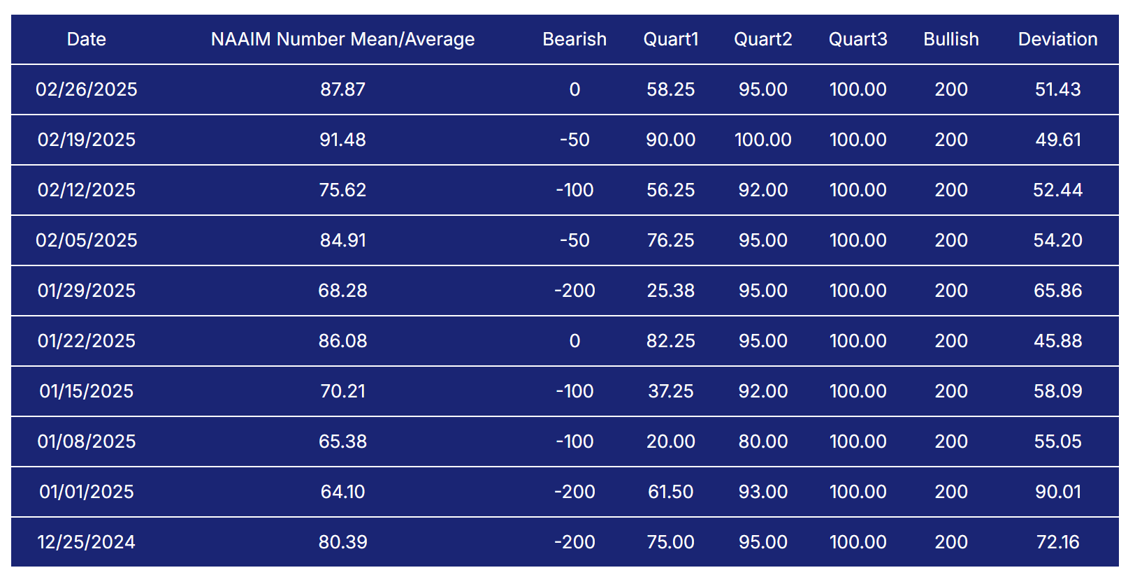
NAAIM Exposure Index
The NAAIM Exposure Index (National Association of Active Investment Managers Exposure Index) measures the average exposure to U.S. equity markets as reported by its member firms. These are typically active money managers who provide their equity exposure levels weekly. The index offers insight into how much these managers are investing in equities at any given time, ranging from being fully short (-100%) to leveraged long (up to +200%).
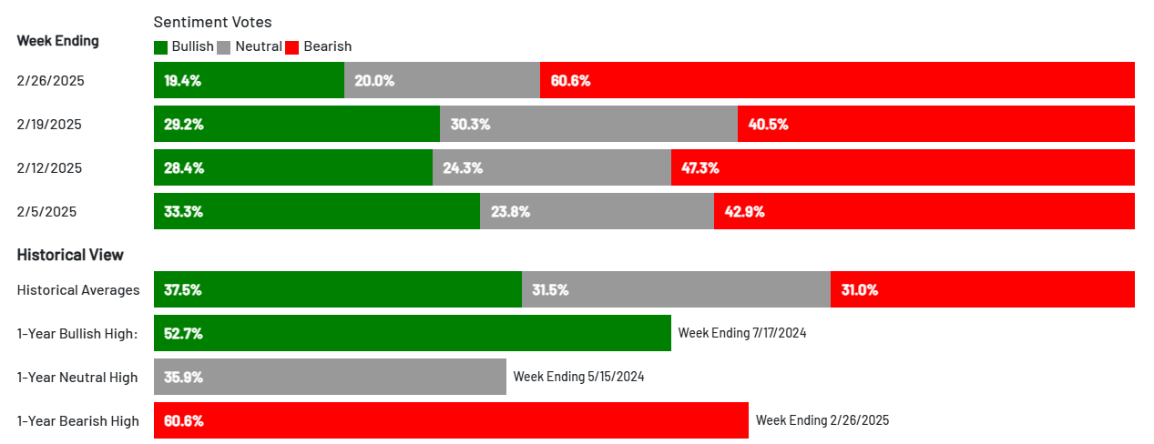
AAII Investor Sentiment Survey
The AAII Investor Sentiment Survey is a weekly survey conducted by the American Association of Individual Investors (AAII) to gauge the mood of individual investors regarding the direction of the stock market over the next six months. It provides insights into whether investors are feeling bullish (expecting the market to rise), bearish (expecting the market to fall), or neutral (expecting the market to stay about the same).
Key Points:
Bullish Sentiment: Reflects the percentage of investors who believe the stock market will rise in the next six months.
Bearish Sentiment: Represents those who expect a decline.
Neutral Sentiment: Reflects investors who anticipate little to no market movement.
The survey is widely followed as a contrarian indicator, meaning that extreme levels of bullishness or bearishness can sometimes signal market turning points. For example, when a large number of investors are overly optimistic (high bullish sentiment), it could suggest a market top, while excessive pessimism (high bearish sentiment) may indicate a market bottom is near.
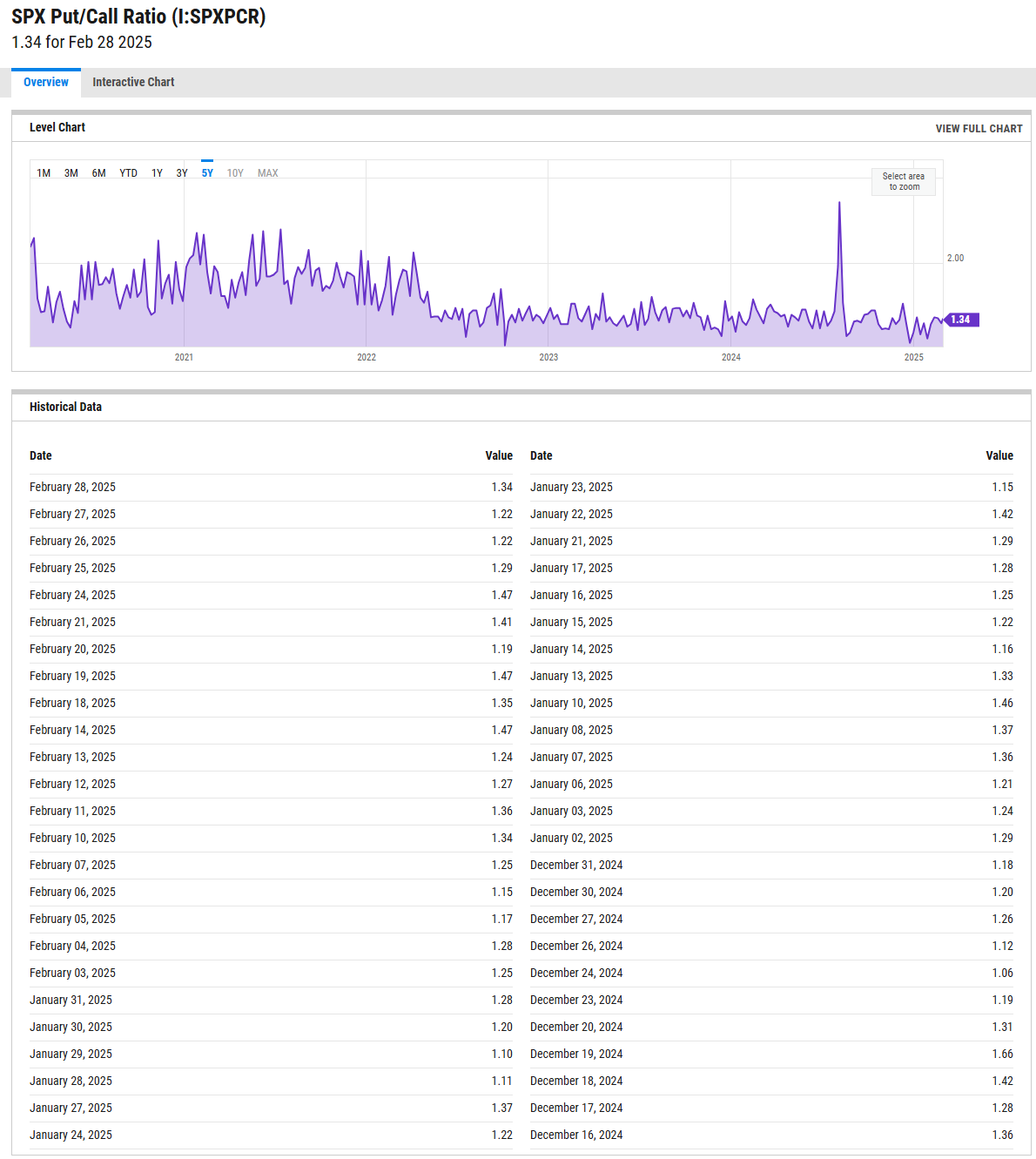
SPX Put/Call Ratio
The SPX Put/Call Ratio is an indicator that is used to gauge market sentiment. This is calculated as the ratio between trading S&P 500 put options and S&P call options. A high put/call ratio can indicate fear in the markets, while a low ratio indicates confidence. For example, in 2015, the Put-Call ratio was as high as 3.77 because of market fears stemming from various global economic issues like a GDP growth slowdown in China and a Greek debt default.
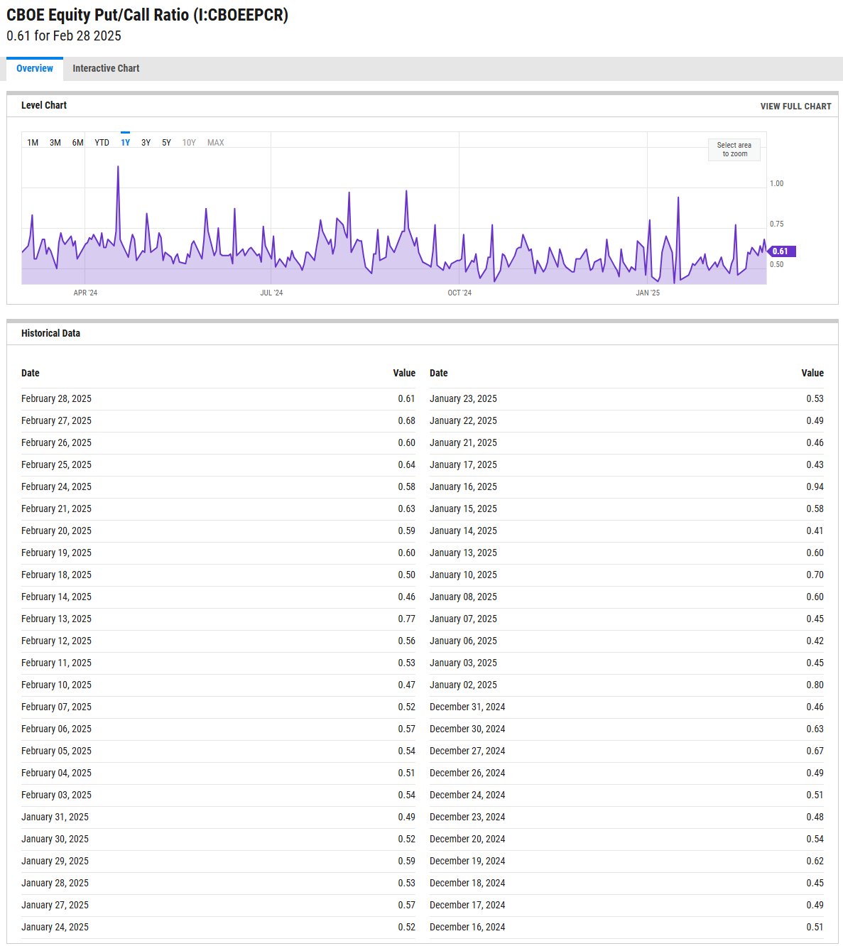
CBOE Equity Put/Call Ratio
The CBOE (Chicago Board Options Exchange) equity put/call ratio is a sentiment indicator used by traders and analysts to gauge market sentiment and potential shifts in investor behavior. It is calculated by dividing the volume of put options by the volume of call options on equities. Here’s what it reveals and how it is generally interpreted:
High Put/Call Ratio: When the put/call ratio is high (above 1.0), it suggests that there is more demand for put options than call options. This typically reflects a more bearish sentiment, as investors may be hedging against potential declines or expecting the market to fall.
Low Put/Call Ratio: Conversely, a low put/call ratio (below 0.7) indicates a higher volume of call options compared to puts, reflecting bullish sentiment. Investors may be expecting upward momentum and are positioning themselves to profit from price gains
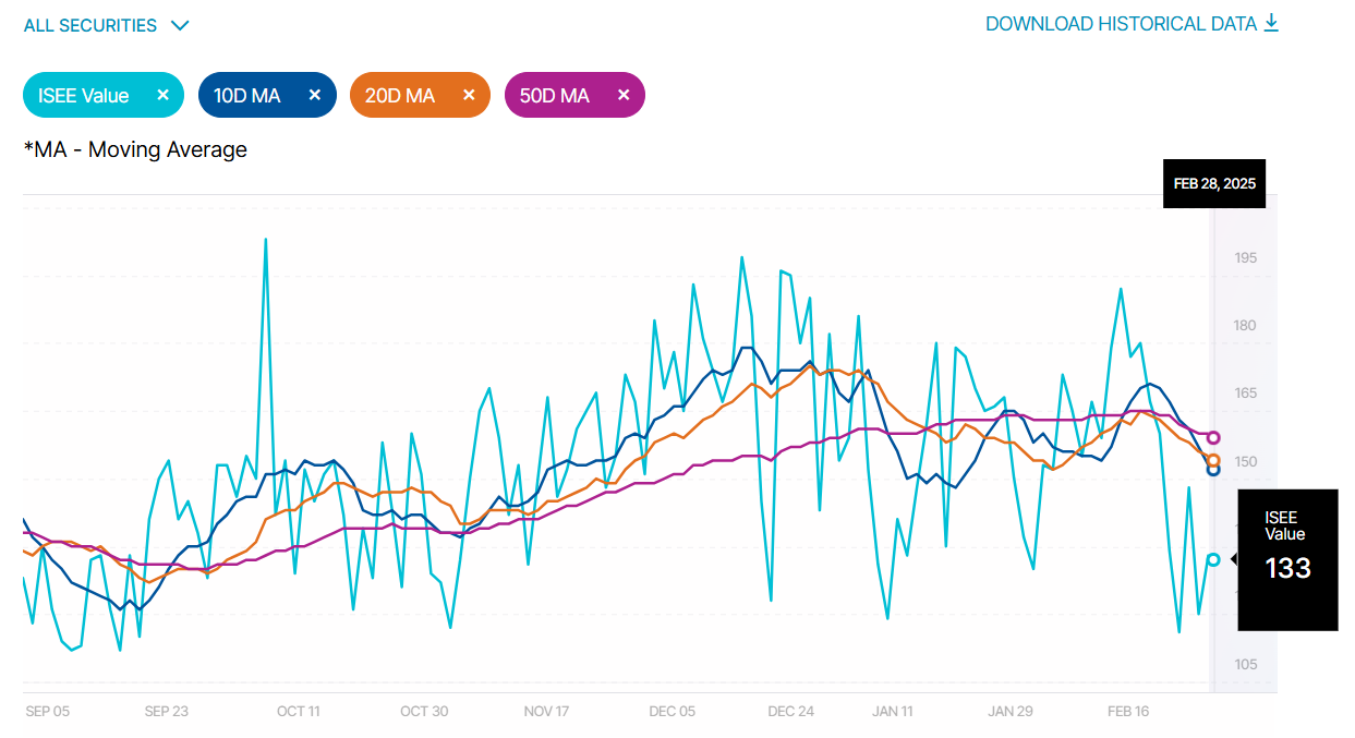
ISEE Sentiment Index
The ISEE (International Securities Exchange Sentiment) Index is a measure of investor sentiment derived from options trading. Unlike traditional put/call ratios, the ISEE Index focuses only on opening long customer transactions and is adjusted to remove market-maker and firm trades, providing a purer sentiment reading.
The ISEE Index typically ranges from 0 to 200, with readings above 100 indicating more call options being bought relative to put options, suggesting bullish sentiment. Conversely, readings below 100 suggest bearish sentiment, with more puts being purchased relative to calls.
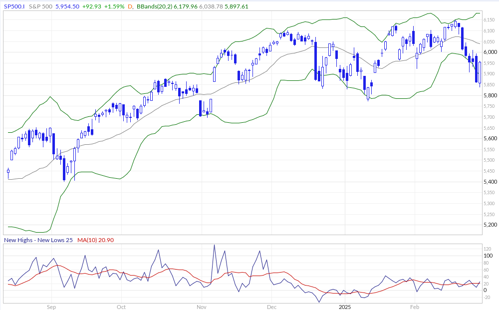
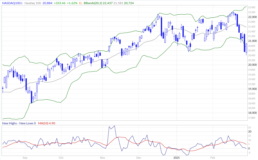
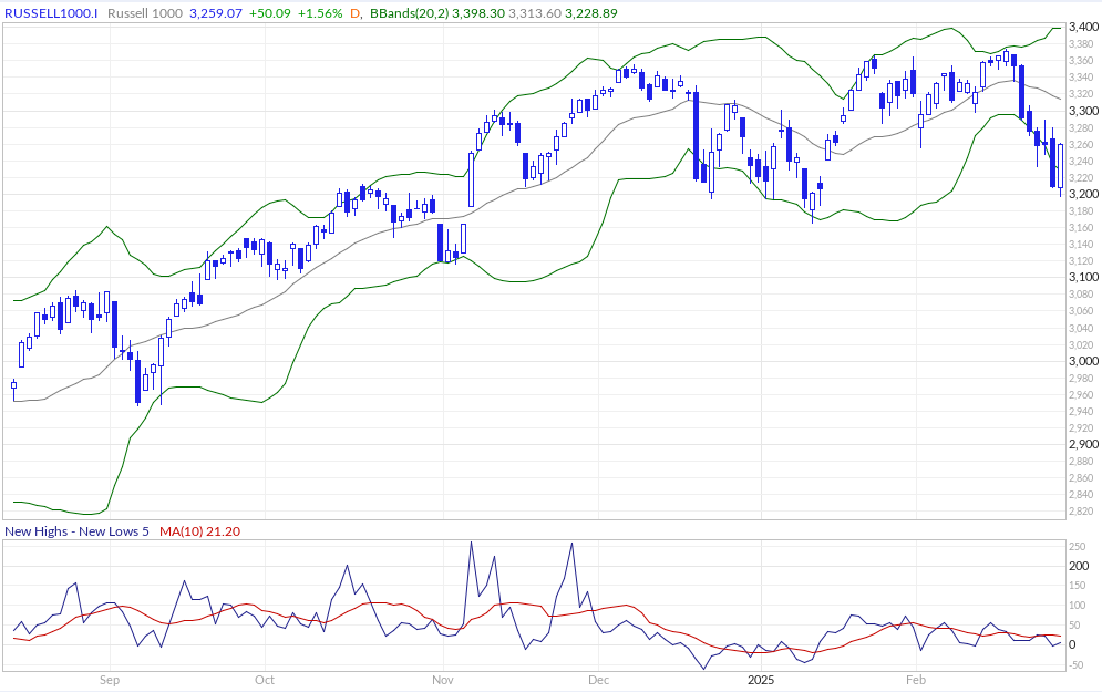
New Highs - New Lows
The New Highs - New Lows indicator (NH-NL) displays the daily difference between the number of stocks reaching new 52-week highs and the number of stocks reaching new 52-week lows. The NH-NL indicator generally reaches its extreme lows slightly before a major market bottom. As the market then turns up from the major bottom, the indicator jumps up rapidly. During this period, many new stocks are making new highs because it's easy to make a new high when prices have been depressed for a long time. The NH-NL indicator oscillates around zero. If the indicator is positive, the bulls are in control. If it is negative, the bears are in control. As the cycle matures, a divergence often occurs as fewer and fewer stocks are making new highs (the indicator falls), yet the market indices continue to reach new highs. This is a classic bearish divergence that indicates that the current upward trend is weak and may reverse.
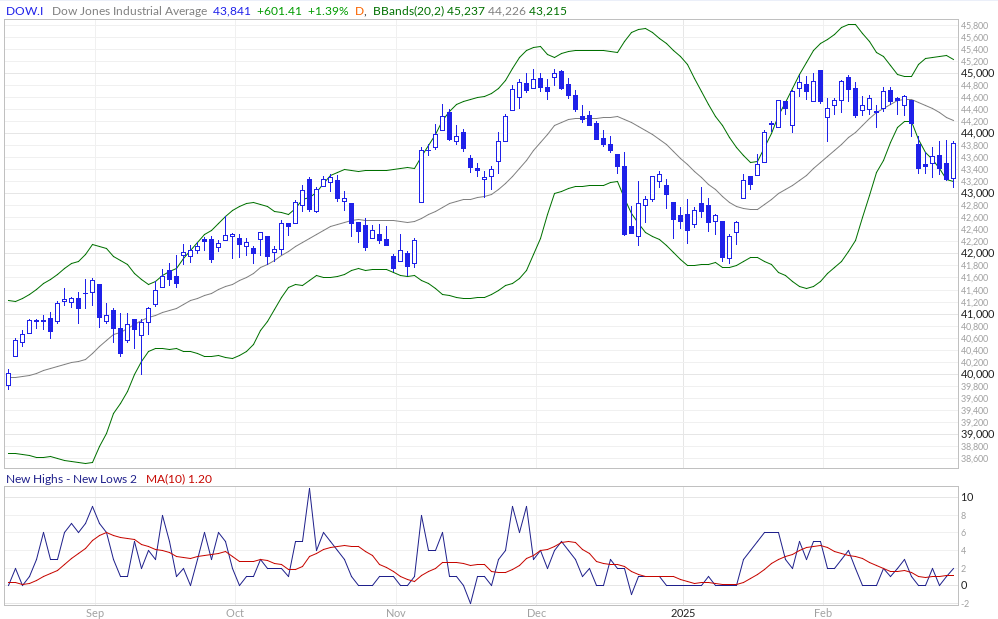
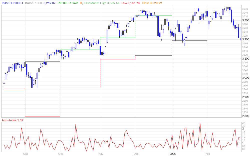
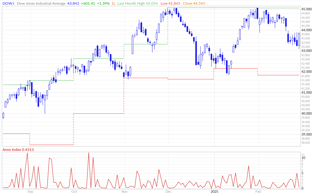
ARMS Index
The Arms Index, also known as the TRIN (Short-Term TRading INdex), was developed by Richard Arms in the 1960s. It is calculated by dividing the ratio of advancing stocks to declining stocks by the ratio of advancing volume to declining volume. Interpreting the Arms Index involves looking at its value in relation to certain thresholds. A value below "1" is considered bullish, indicating that advancing stocks and volume dominate the market. Conversely, a value above "1" is considered bearish, suggesting that declining stocks and volume are more prevalent. Extremely low values (below 0.5) or high values (above 2) are often seen as potential reversal signals.
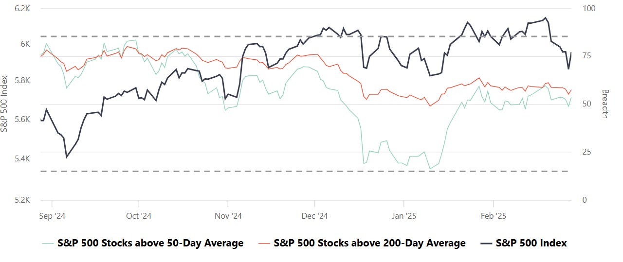
S&P Breadth
Breadth, in the context of stock market analysis, refers to the measure of how many stocks in a given index (such as the S&P 500) are participating in a trend, such as advancing or declining relative to a certain moving average (e.g., 50-day or 200-day).
Market Strength Assessment:
Breadth provides insight into whether a market rally or decline is broad-based or driven by only a few large-cap stocks. A rally supported by a high percentage of stocks above their 50-day or 200-day averages is generally considered healthier and more sustainable.
Early Warning Signals:
Divergences between breadth indicators and the index price can signal potential reversals. For example:
If the index is rising, but the number of stocks above their moving averages is declining, it may indicate weakening underlying strength and potential for a pullback.
Conversely, if breadth improves while the index remains flat or declines, it may suggest accumulating strength for a future rally.
Trend Confirmation:
Breadth indicators can confirm trends. For instance, a strong majority of stocks above their moving averages signals robust market momentum, providing confidence in the prevailing trend.
Identifying Overbought or Oversold Conditions:
Extremely high or low breadth readings can signal overbought or oversold conditions, which might lead to mean reversion. For example:
If nearly all stocks are above their 50-day or 200-day averages, it may suggest overbought conditions.
Conversely, extremely low levels indicate oversold conditions and potential for a bounce.
Breadth and Timing Investments:
Entry Points:
When breadth improves (e.g., more stocks move above their 50-day or 200-day moving averages) after a market pullback, it can indicate a good time to start building positions as the broader market is regaining strength.
Exit Points:
Breadth deterioration during a rally may suggest it’s time to reduce exposure, especially if only a small number of stocks are driving index gains. This is often a warning sign of an impending correction.
Volatility and Risk Management:
Weak breadth in volatile markets may prompt caution or defensive positioning. Conversely, improving breadth can justify taking on more risk during uptrends.
CME Fedwatch
What is the likelihood that the Fed will change the Federal target rate at upcoming FOMC meetings, according to interest rate traders? Use CME FedWatch to track the probabilities of changes to the Fed rate, as implied by 30-Day Fed Funds futures prices.
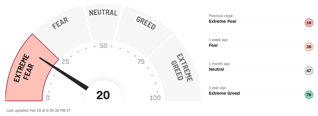
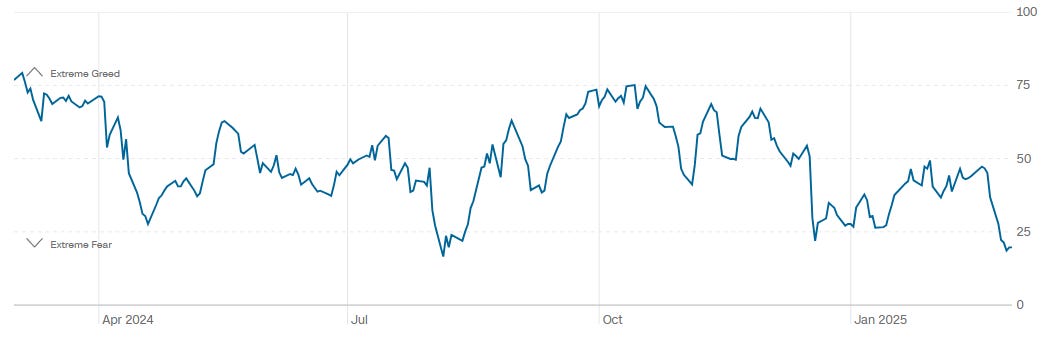
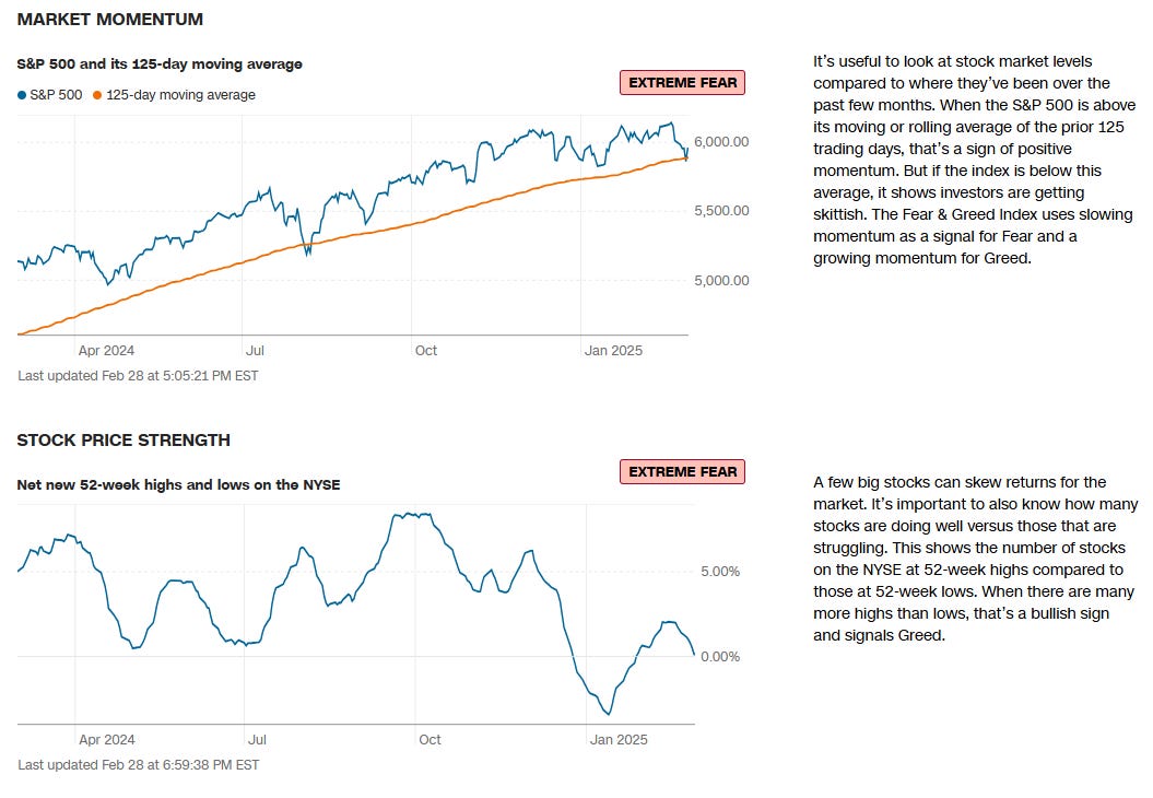
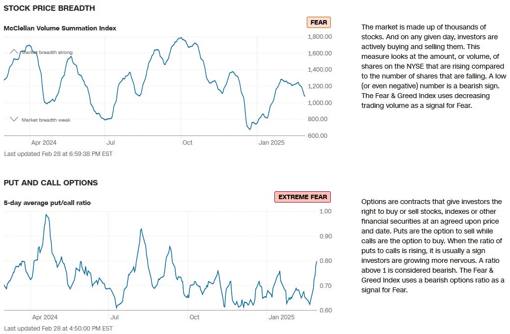
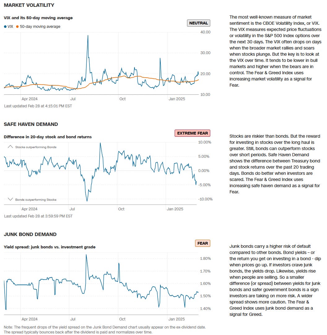
CNN Fear & Greed Constituent Data Points & Composite Index
Institutional S/R Levels for Major Indices
When you’re a large institutional player, your primary goal is to find liquidity - places to do a ton of business with the least amount of slippage possible. VolumeLeaders.com automatically identifies and visually plots the exact spots where institutions are doing business and where they are likely to return for more. It’s one of the primary reasons “support” and “resistance” concepts work and truly one of the reasons “price has memory”.
Levels from the VolumeLeaders.com platform can help you formulate trades theses about:
Where to add or take profit
Where to de-risk or hedge
What strikes to target for options
Where to expect support or resistance
And this is just a small sample; there are countless ways to leverage this information into trades that express your views on the market. The platform covers thousands of tickers on multiple timeframes to accommodate all types of traders.
SPY 0.06%↑
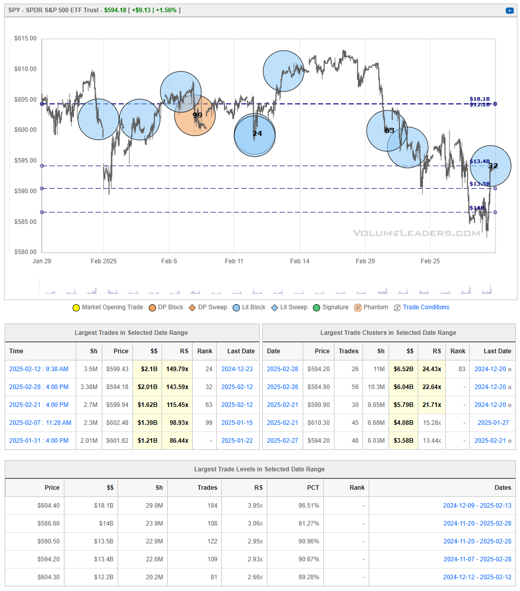
After selling off from the $610 area in mid‐February, SPY found support near $585–$590, where strong institutional activity helped stem the decline. The recent bounce has lifted price back to the mid‐$590s, but it remains below heavier overhead supply in the $600–$605 zone. If buyers can maintain momentum and push SPY above $600, a run toward the prior swing high near $610 is possible. Conversely, a failure to break that ceiling—or a slip back beneath $590—would indicate renewed selling pressure, increasing the odds of revisiting February’s lows in the mid‐$580s.
QQQ 0.03%↑
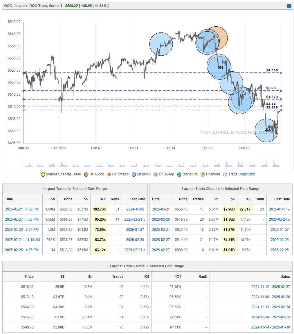
QQQ suffered a sharp February decline from the mid‐$530s down to the $500 level, where strong buying interest finally emerged. The recent rebound has lifted price back toward the $505–$510 region, but significant overhead supply still looms around $515–$520, where prior institutional trades suggest sellers may step in.
If QQQ can continue holding above $505 and push back into the $515–$520 zone on strong volume, it would indicate that buyers have absorbed a good portion of the recent selling pressure, potentially fueling a more sustained recovery. However, a failure to clear that overhead band—or a slip back under $500—would signal that bears remain firmly in control, raising the prospect of revisiting or even undercutting February’s lows.
IWM 0.00%↑
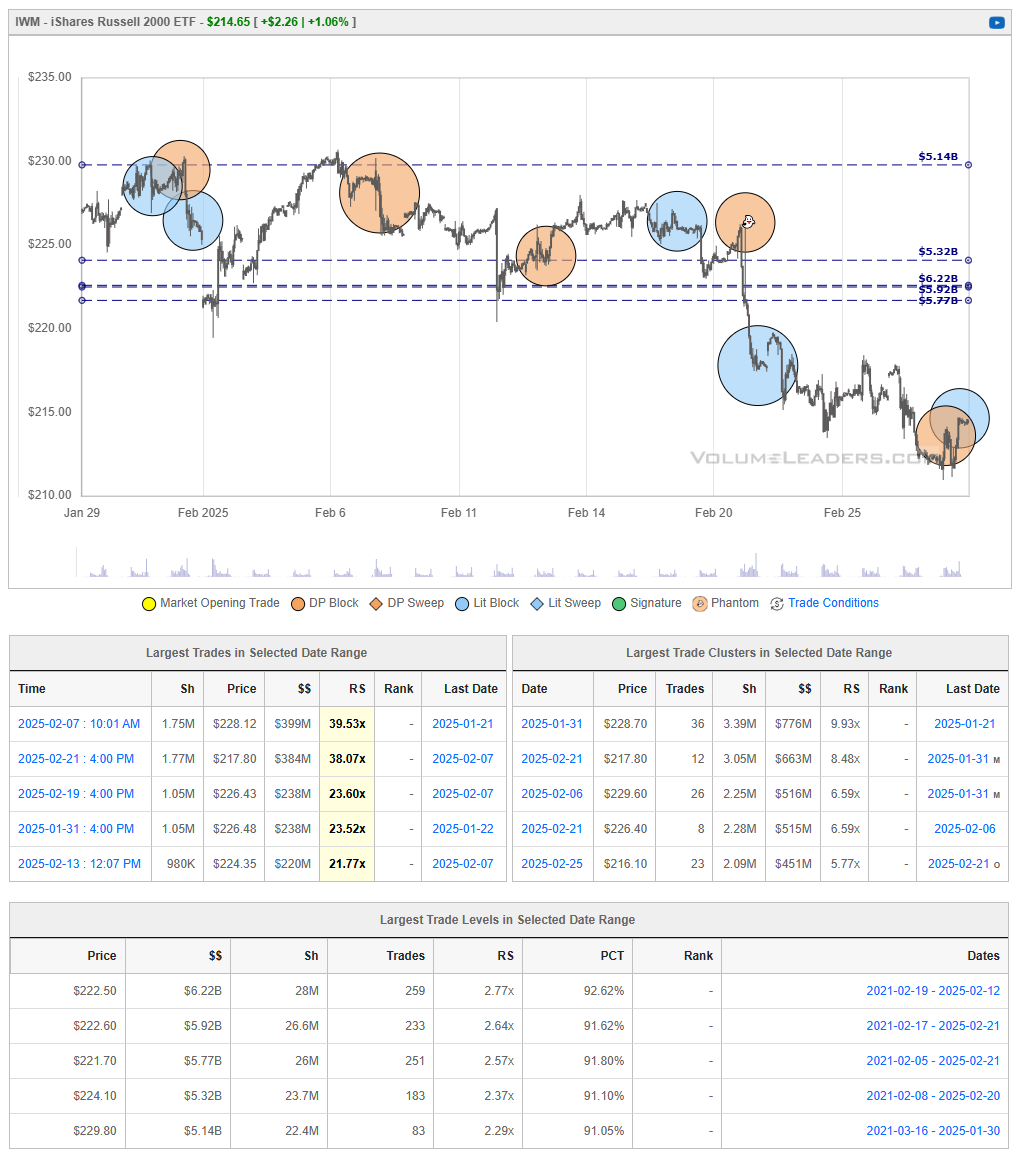
IWM fell sharply below key support near $220 in late February, but recently found buying interest in the $215–$216 zone, prompting a modest rebound. Price is now hovering just above $214–$215, still well under the heavier overhead supply around $220–$222, where the ETF previously struggled to maintain gains.
If buyers can push IWM back above $220 and hold it there, it would signal a potential trend reversal, with scope to retest the mid‐$220s. However, failure to clear that resistance—or a slip back below $215—would underscore that sellers remain in control, raising the probability of a renewed decline toward recent lows.
DIA 0.00%↑
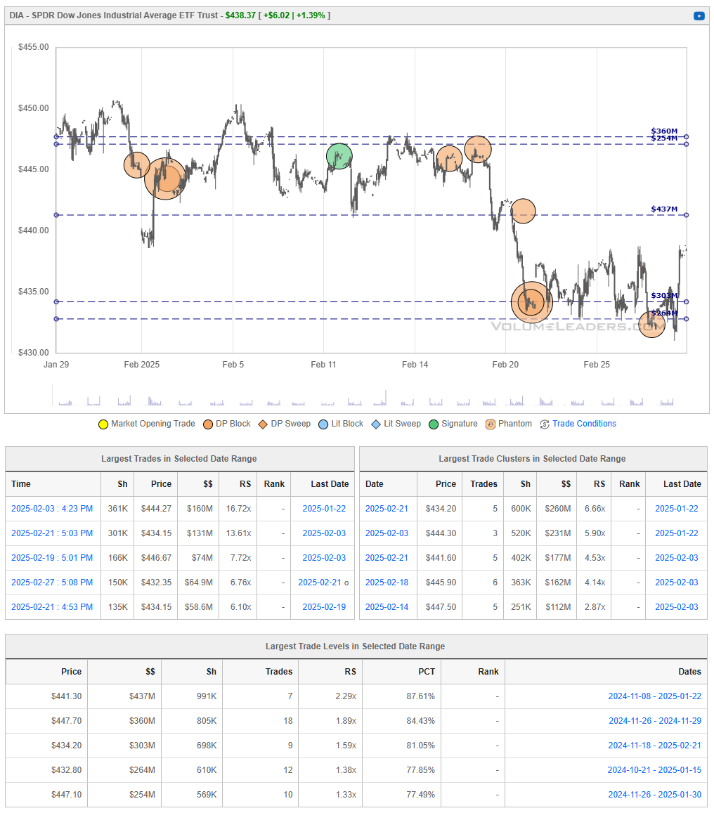
DIA bounced sharply off the $430–$432 zone at the end of the month and is now attempting to reclaim lost ground above $435. However, notable overhead supply remains in the $440–$445 region, where previous institutional trades may still cap further upside. If buyers can push DIA convincingly above $445, it would open the door for a retest of prior highs in the mid‐$450s. Conversely, a rejection near $440–$445—especially if price slips back under $435—would signal that sellers remain active, raising the likelihood of another move toward the recent lows near $430.
Institutional Order Flow
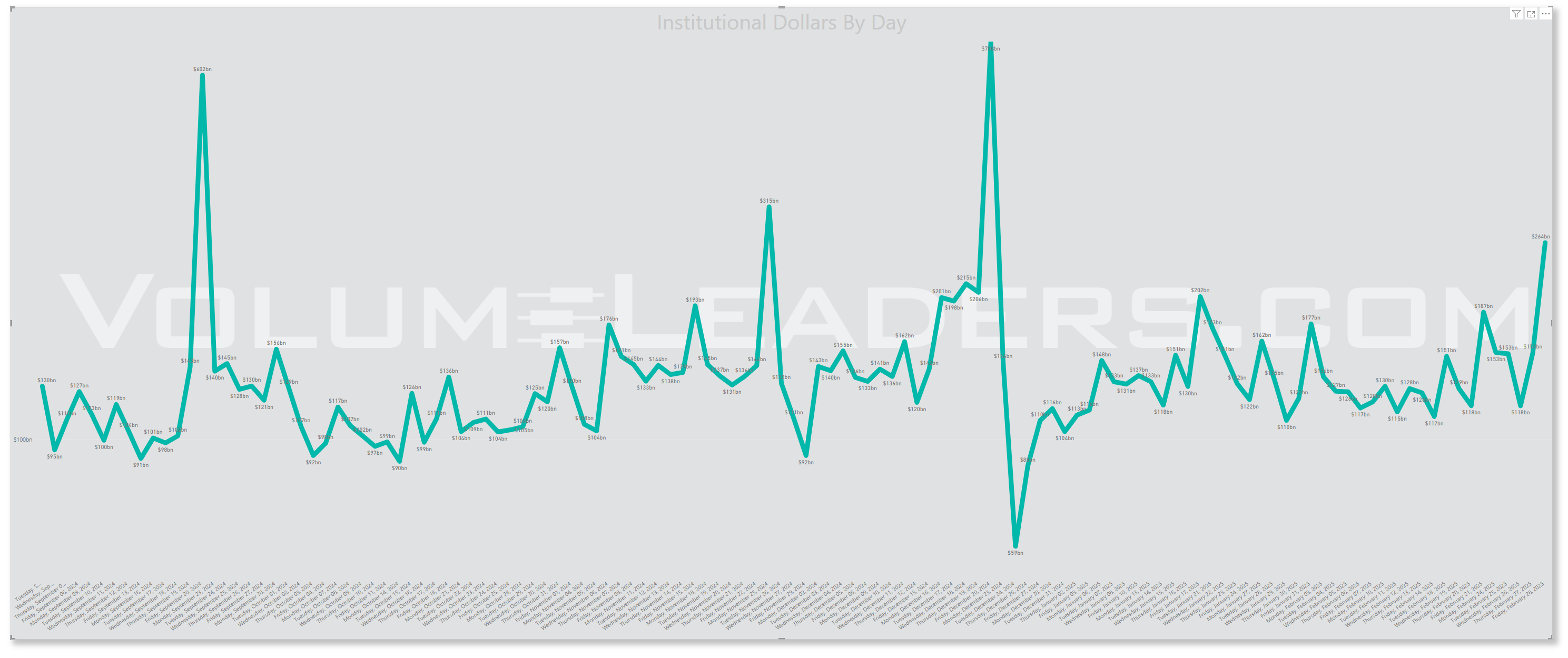
Rolling 90-Day Dollars By Day
This chart shows institutional activity by dollars by day on a rolling 1-year basis. From a theoretical standpoint, examining a chart of daily institutional dollar activity over the course of a year can offer several insights and possible inferences, though all should be approached with caution since the data alone may not prove causality or confirm underlying reasons. Some potential takeaways include:
Event-Driven Behavior:
Sharp, singular spikes on certain days might correlate with major market-moving events. These could include central bank policy announcements, significant geopolitical news, sudden macroeconomic data releases (like employment reports or GDP data), earnings seasons for large-cap companies, or unexpected shocks (e.g., mergers, acquisitions, regulatory changes).Liquidity Dynamics:
Institutions often concentrate large trades on days with higher expected liquidity. For instance, heightened activity might coincide with index reconstitutions, option expiration dates, or the days leading up to or following a major index rebalance, when large amounts of capital shift hands simultaneously.Risk Management and Hedging Activity:
Institutions may significantly adjust their exposures on days that are critical from a risk management perspective. Large spikes can occur if hedge funds, pension funds, or asset managers are rolling over futures contracts, initiating or closing out large hedges, or reacting to volatility triggers.Market Sentiment Indicators:
While the data is purely transactional, the sheer volume of institutional involvement on certain days might indirectly hint at changing sentiment or strategic shifts.
In essence, a chart like this can lead you to hypothesize that institutional trading volumes are not constant or random but rather influenced by a mix of predictable calendar effects, major market events, liquidity considerations, risk management decisions, and strategic allocation shifts.
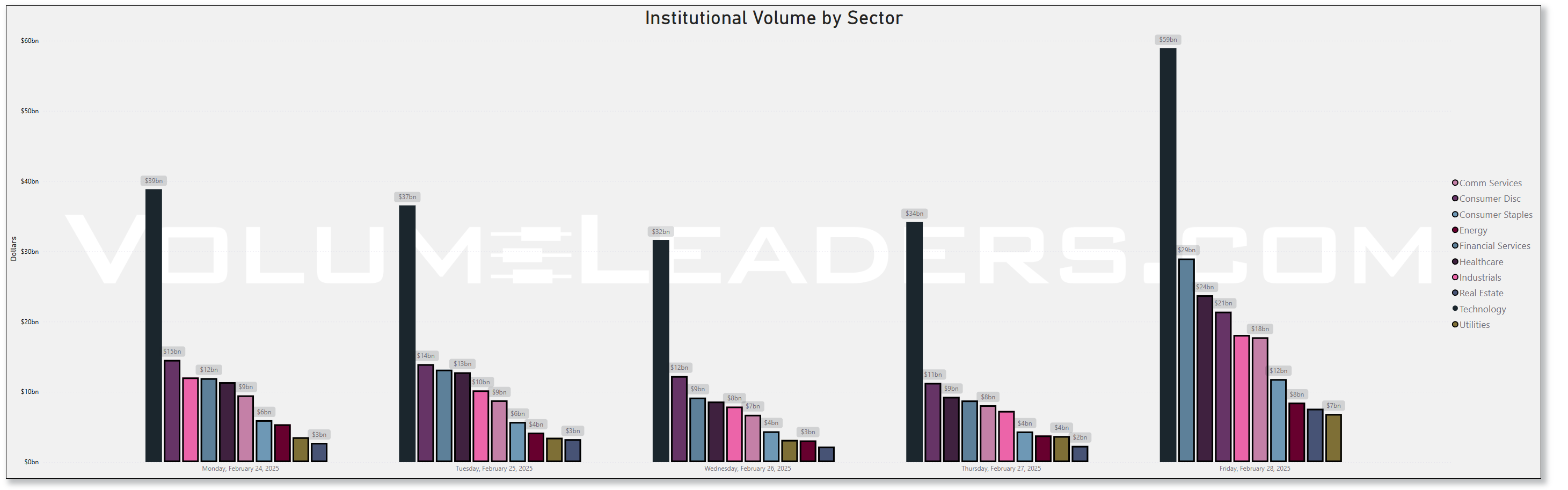
Top Institutional Order Flow By Sector By Week For The Past 90-Days
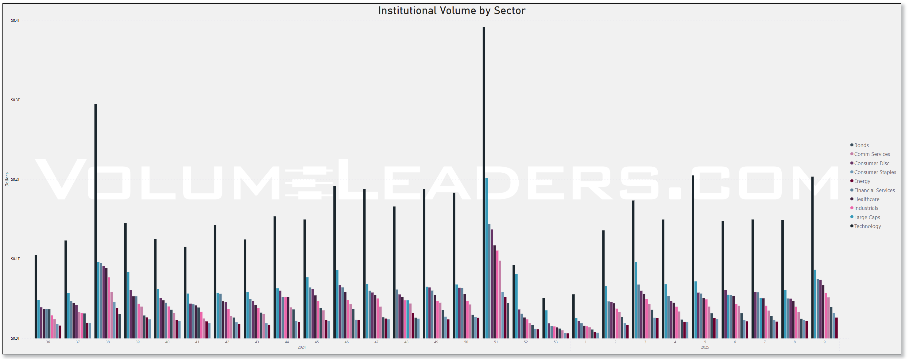
In the most recent weeks (weeks 6-8 of 2025), there's been a steady increase in institutional activity across most sectors after a period of lower volume in late January (weeks 3-5).
Technology sector (dark blue bars) shows consistent institutional participation throughout the period, but appears to have relatively decreased in the most recent weeks compared to its dominance in earlier periods. The decreased appetite for tech was some of the most important foreshadowing of the recent drawdown. Renewed interest comes mixed-in with EOM/BOM flows but the relative increase is still significant and necessary for those seeking at least a bounce in indices.
Financial Services (purple) has maintained steady institutional interest and shows proportionally stronger representation in recent weeks.
Healthcare (light blue) displays increasing institutional volume over the last 2-3 weeks, potentially indicating sector rotation toward more defensive positions.
Energy sector (red) shows minimal institutional volume throughout the period, reflecting its smaller market weighting and possibly lower institutional interest.
The latest data (far right bars) shows a balanced distribution across sectors with notable participation in Large Caps, Technology, Financials, and Industrials, suggesting institutions may be maintaining diversified exposure rather than making concentrated sector bets.
The recent balanced sector allocation pattern suggests institutional investors may be positioning more neutrally after the volatility observed in prior charts, neither aggressively bullish nor bearish on any particular sector.
This institutional flow data, when viewed alongside the SPY price action and large block trades from VL indicates cautious positioning by large investors with some defensive rotation but no extreme sector positioning that would signal strong directional conviction.
Top Institutional Order Flow In Equities
These are incredibly important charts to watch as they contains lots of nuanced suggestions at a thematic level. Watch these charts closely week-to-week to stay informed about where institutional money is flowing, adjust your strategies based on momentum, align your portfolio with macroeconomic and market trends, and manage risks more effectively by avoiding sectors losing institutional favor.
Sector Rotation Insights: The chart highlights which sectors are attracting institutional activity and which are losing favor. Institutions often lead market trends, so tracking shifts in their focus can indicate sector rotations.
Sentiment Analysis: The level of institutional activity reflects confidence in specific sectors. Rising activity in traditionally defensive sectors (e.g., healthcare, utilities) may indicate caution, while a surge in growth sectors (e.g., technology, consumer discretionary) could suggest optimism.
Emerging Trends: Sudden spikes in a previously overlooked sector, like industrials or consumer staples, might hint at emerging opportunities or structural shifts.
Macro Themes: Changes in sector activity often align with broader macroeconomic themes like inflation, interest rates, or geopolitical events. For instance:
Increased activity in energy might indicate concerns about oil supply or rising prices.
Growth in technology could align with innovations or favorable policies.
Risk Management: Declining institutional activity in a sector might signal weakening fundamentals or heightened risks.
Spotting Overcrowding: Excessive activity in a single sector over multiple weeks may suggest overcrowding, which could lead to heightened volatility if institutions begin to exit.
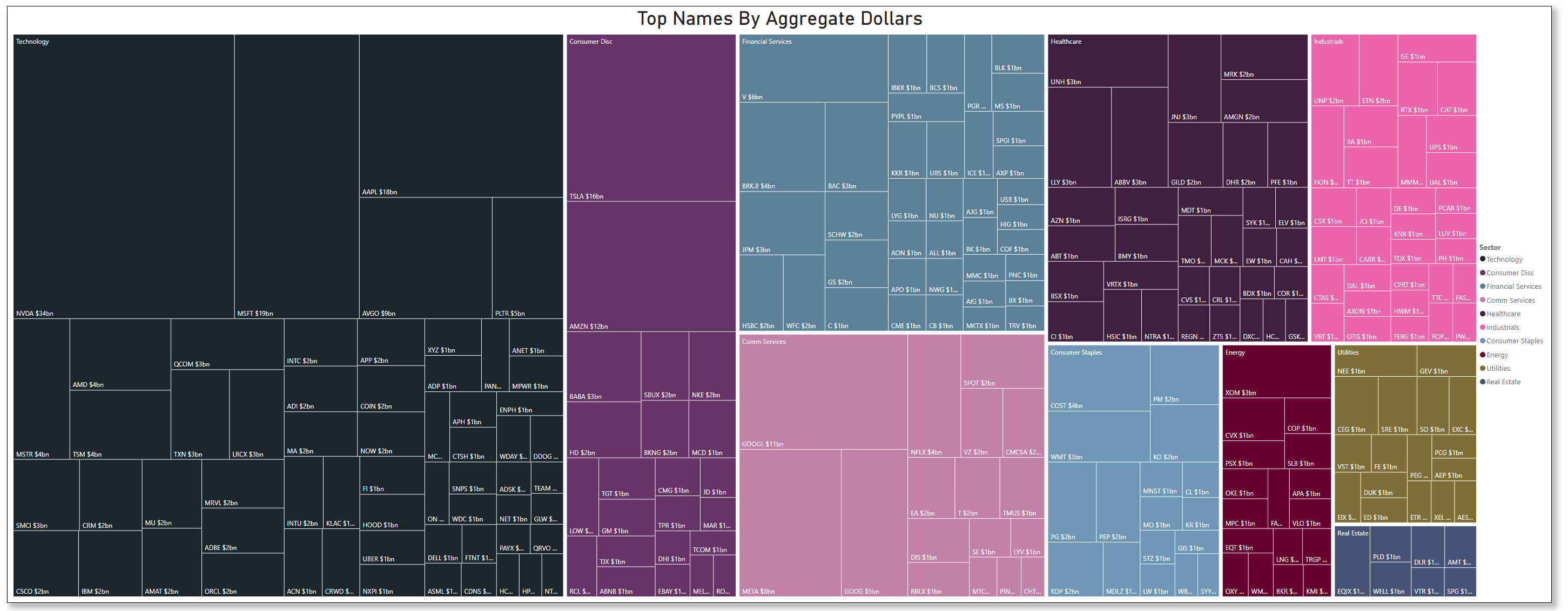
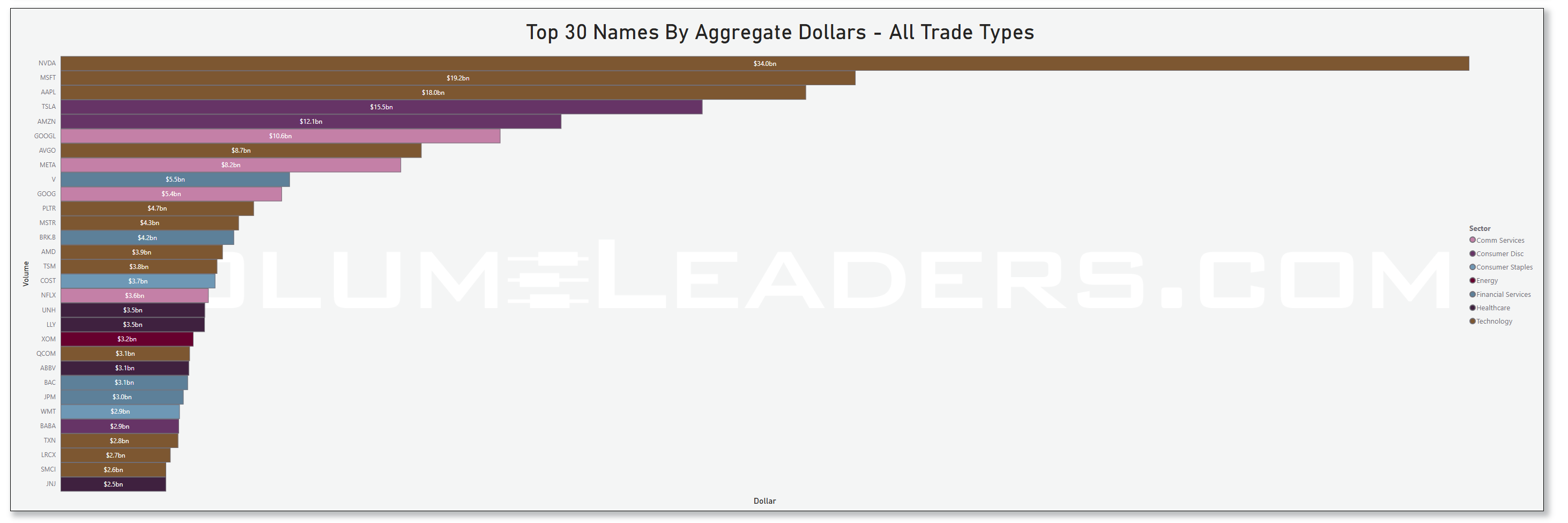
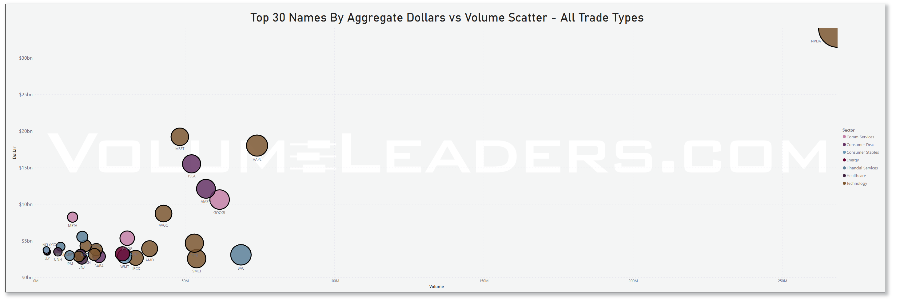
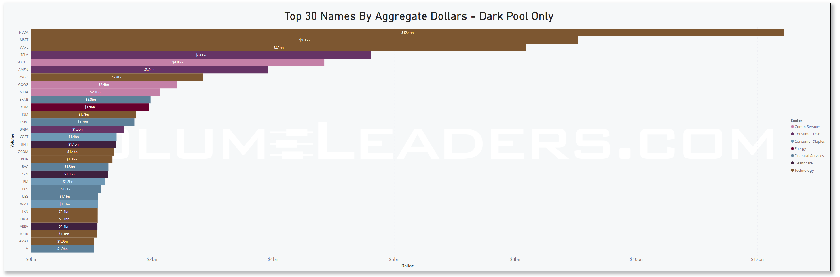
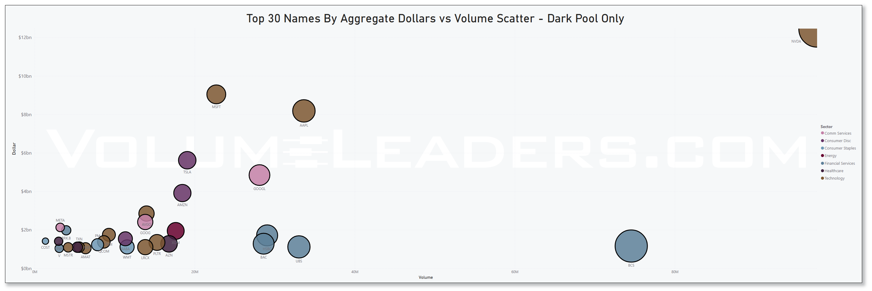
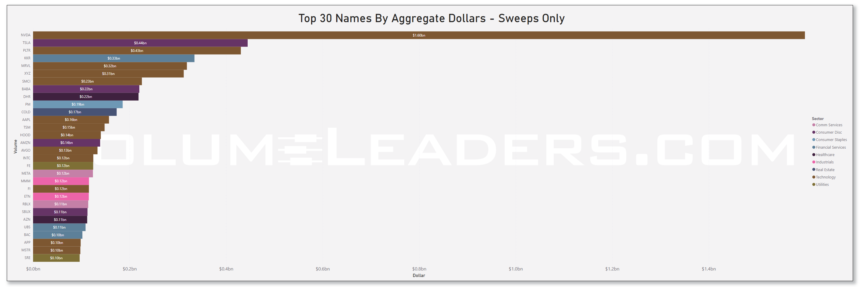
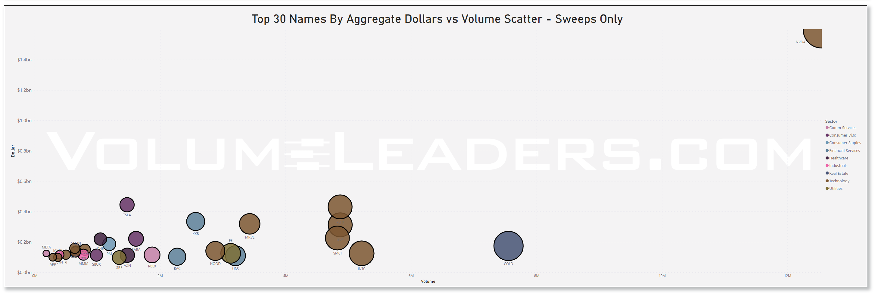
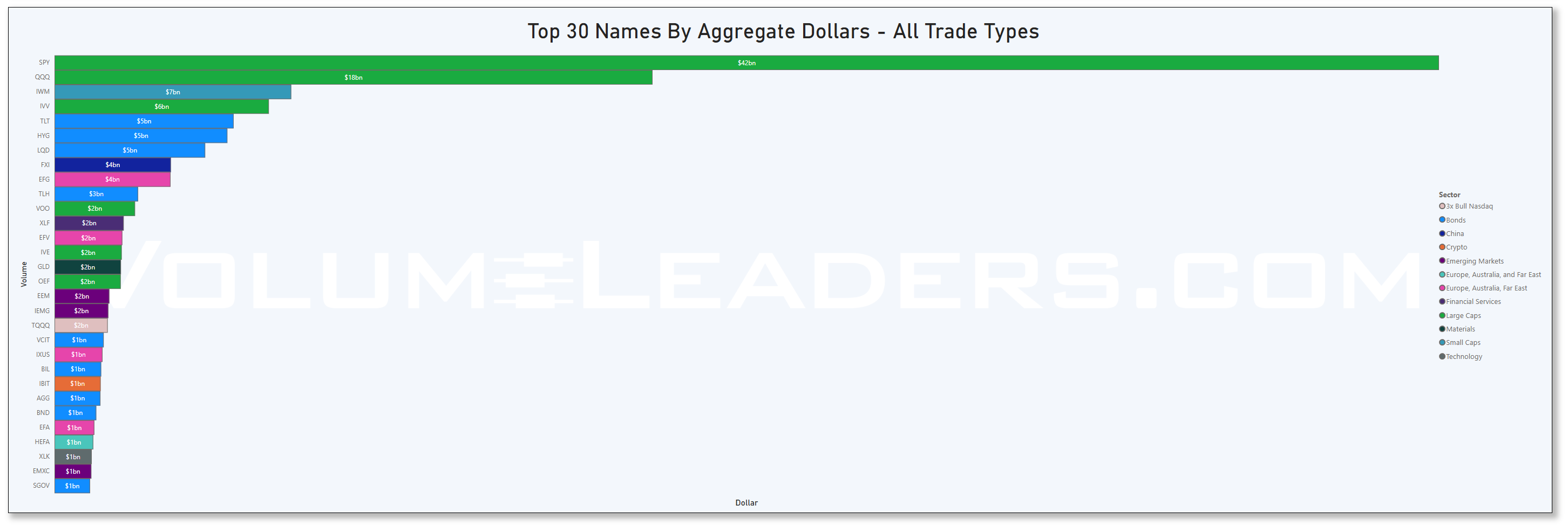
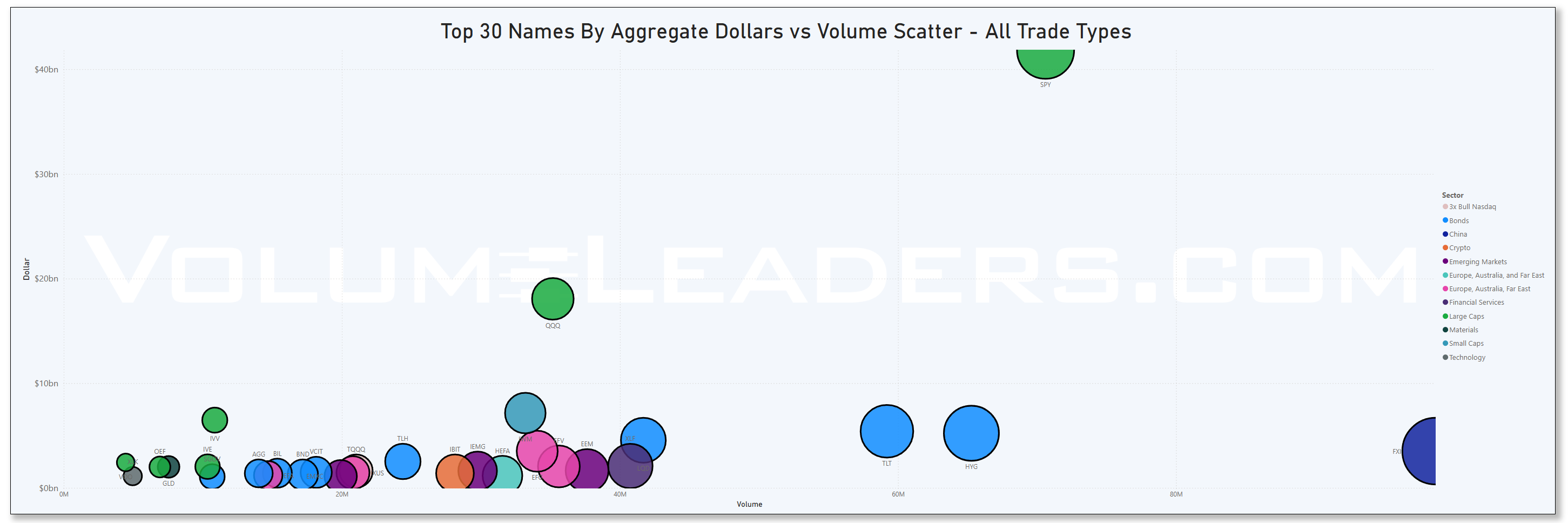
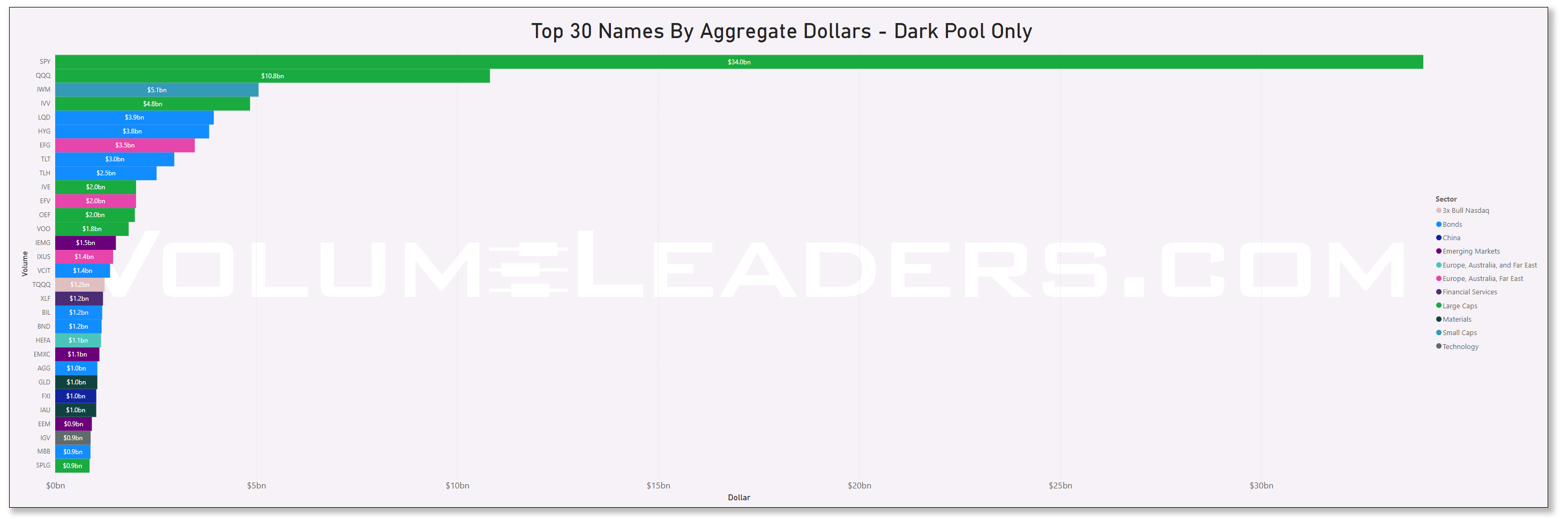
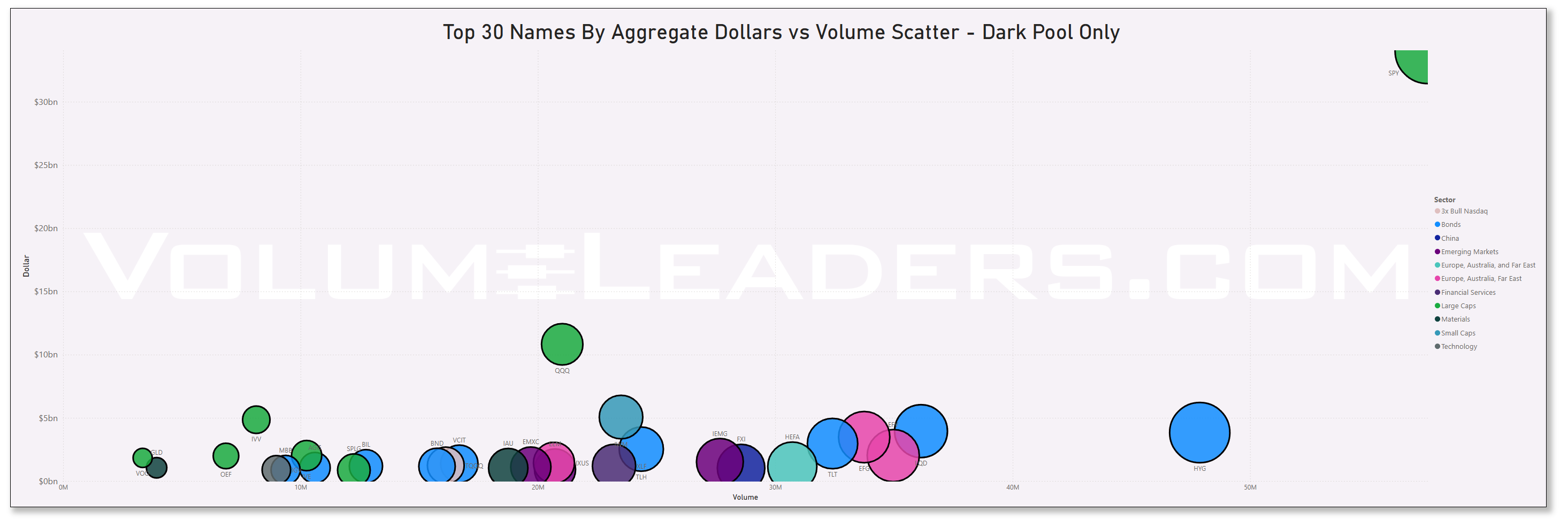
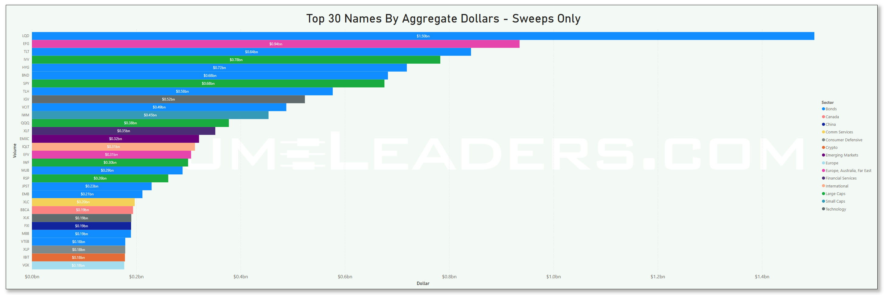
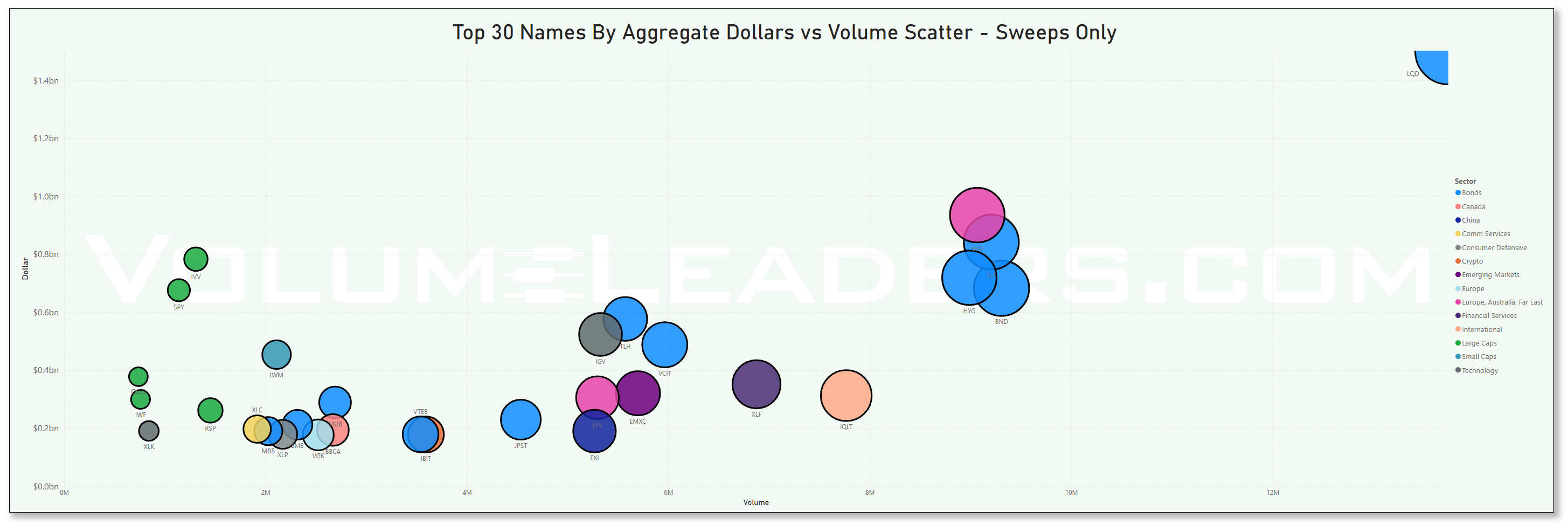
Many excellent trade ideas and sources of inspiration can be found in these prints below. While only the top 30 from each group are displayed, the complete results are accessible in VolumeLeaders.com for you to explore at your convenience any time. Remember to configure trade alerts within the platform to ensure institutional order flows that capture your interest or are significant to you aren’t missed. The blue charts encompass all types of trades, including blocks on lit exchanges; the purple charts exclusively depict dark pool trades; and the green charts represent sweeps only.
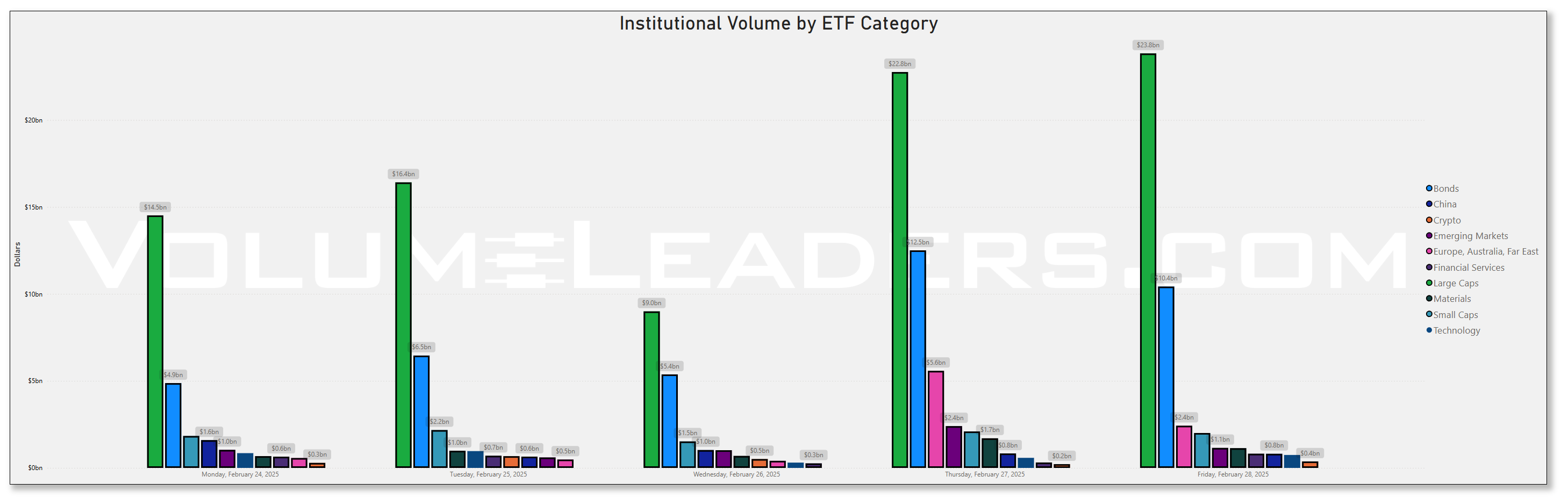
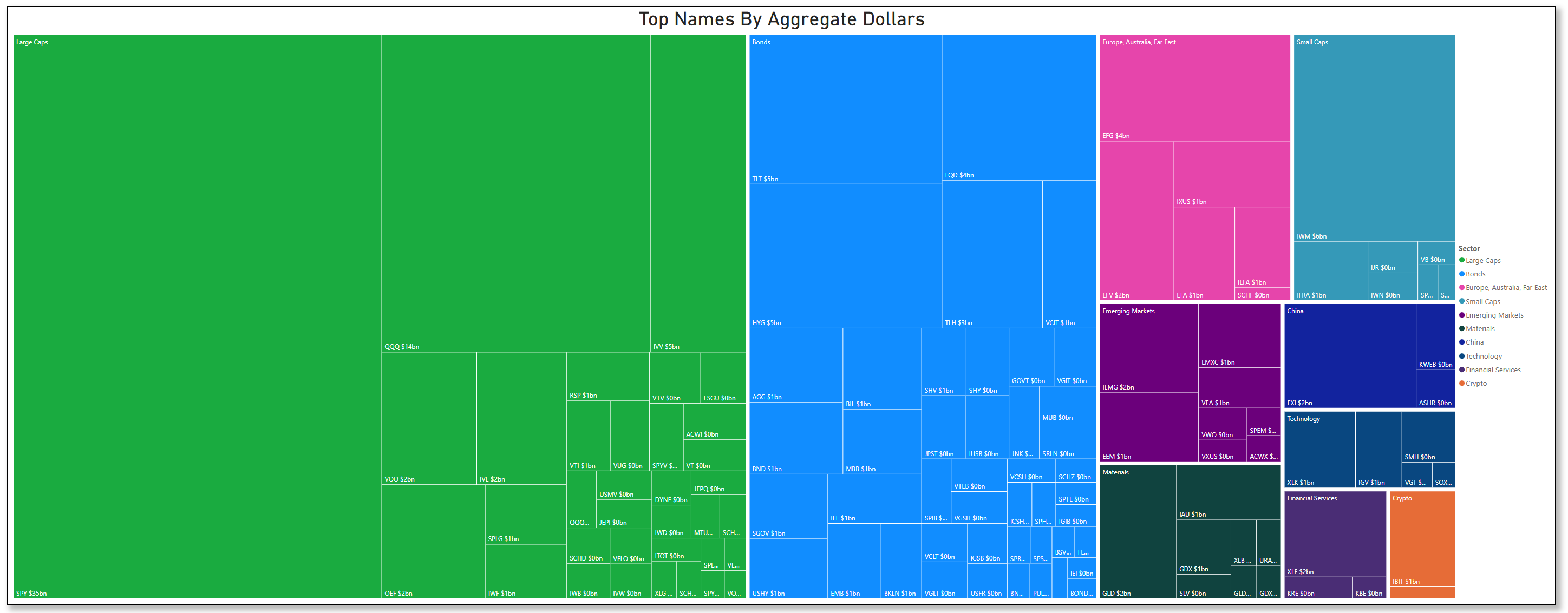
Top Institutional Order Flow In ETFs
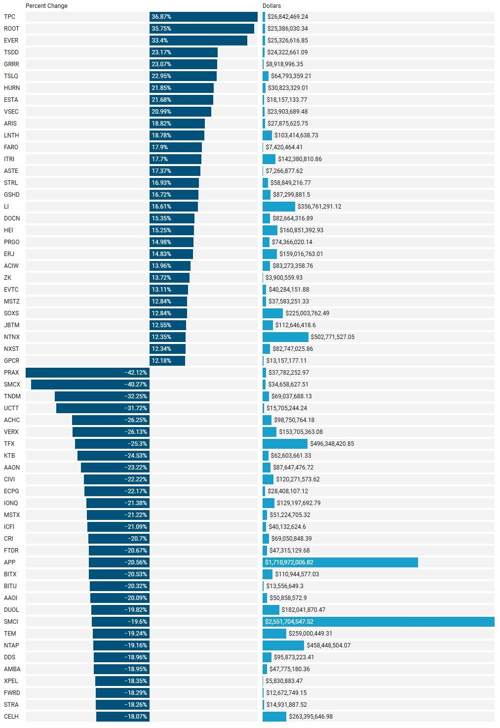
Last Week’s Institutionally-Backed Gainers & Losers
If you’re going to bet on a name, consider one that is officially endorsed by an institution! These are the top percent gainers (green) and percent losers (red) from this week’s open-to-close that had a trade price greater than $20 and institutional involvement. Continue watching tickers from this and prior stacks as these names frequently turn into multi-leg trades with a lot of movement!
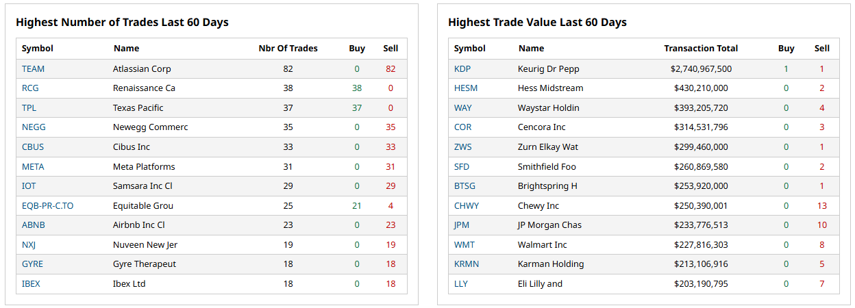
Last Week’s Billion-Dollar Prints
Tickers that printed a trade worth at least $1B last week get a special shout-out. These are massive commitments by institutions that should not be ignored.
Investments In Focus: Bull vs Bear Arguments
Institutions leave footprints that VolumeLeaders.com can illustrate for you while providing context to assess things like institutional conviction and urgency. Theses and data given below are not financial advice, just personal observations that may be wrong; consult a certified financial advisor before making any investment decisions.
SPOT 0.00%↑
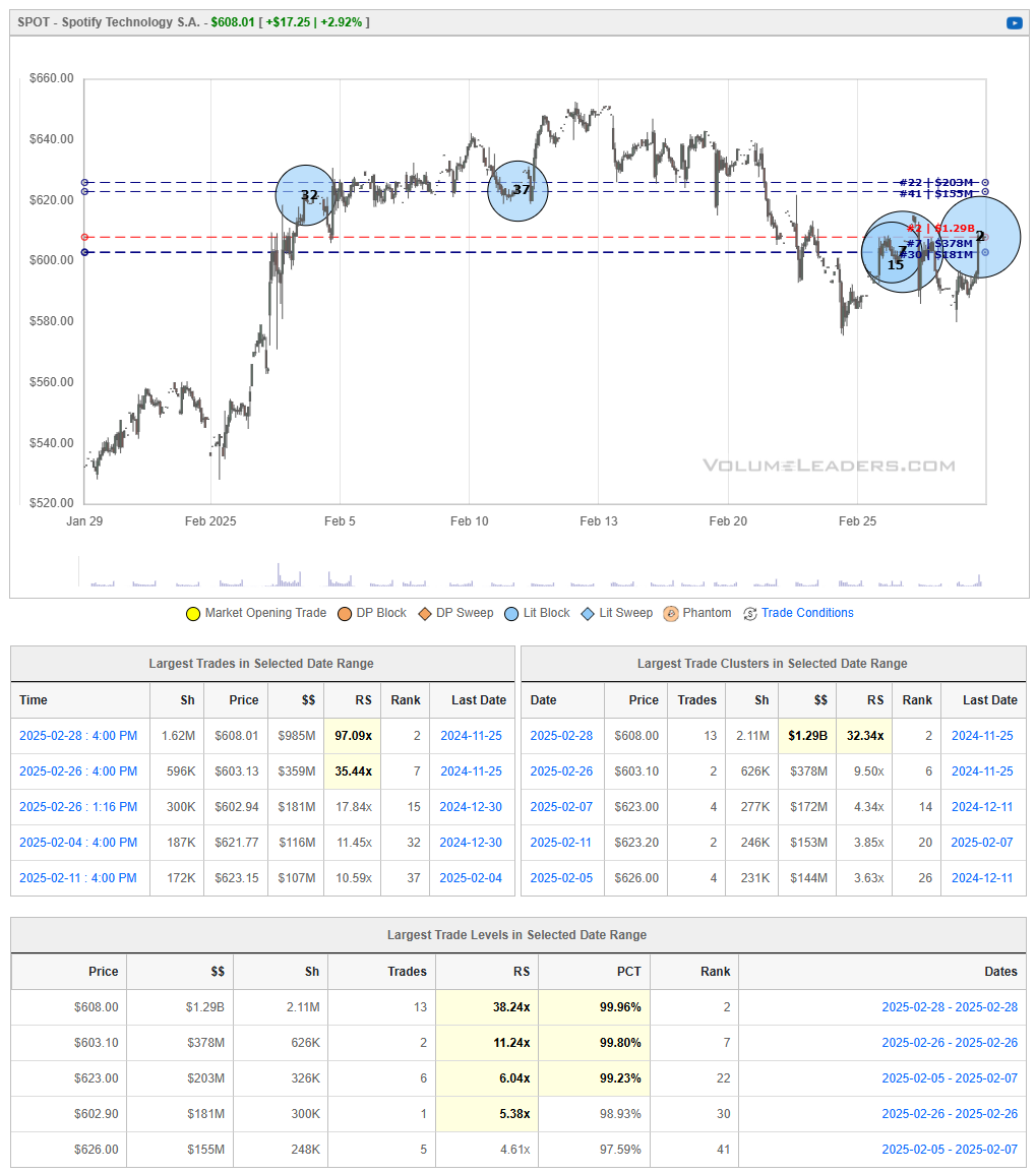
Bullish Perspective for Spotify Technology S.A. (NYSE: SPOT)
Profitability Milestone Demonstrates Business Maturity
In 2024, Spotify reported its first-ever full-year operating profit, marking a significant turning point for the company since its launch in 2008.
Operating income for Q4 2024 reached €477 million, contributing to a full-year profit of €1.4 billion. This profitability resulted from a combination of subscription price hikes, cost-cutting measures, and revenue diversification.
Investors view this as a sign that Spotify is evolving beyond a high-growth but cash-burning business into a more sustainable enterprise capable of delivering long-term shareholder value.
Consistently Growing Subscriber Base Reinforces Market Leadership
As of Q4 2024, Spotify’s monthly active users (MAUs) reached 675 million, an increase of 23% year-over-year, with paid subscribers growing 11% to 263 million.
This growth solidifies its position as the world’s largest music streaming platform, outpacing rivals like Apple Music (88 million paid subscribers) and Amazon Music (~68 million).
Spotify’s continuous expansion into emerging markets like India, Southeast Asia, and Latin America suggests further room for user growth, particularly in the free-tier segment, which acts as a funnel for premium conversions.
Expansion into Podcasts, Video, and Audiobooks Creates New Revenue Streams
Spotify has successfully integrated podcasts and audiobooks into its platform, diversifying beyond music and reducing dependency on expensive music licensing deals.
With exclusive deals with podcasters like Joe Rogan, Bill Simmons, and Call Her Daddy, Spotify is attracting dedicated audiences that increase engagement and advertising revenue.
The company's audiobook offering, introduced in late 2023, is gaining traction as Spotify provides 15 hours of free audiobook listening for premium users, further incentivizing subscriptions.
Ad-Supported Revenue Growth Strengthens Financial Resilience
While premium subscriptions remain the primary revenue driver, Spotify’s advertising revenue surged by 30% year-over-year, accounting for 14% of total revenue—a significant improvement.
The company is monetizing its free-tier users more effectively, using AI-driven ad targeting and partnerships with advertisers, which could help drive overall margin expansion.
As Spotify refines its ad business—especially within podcasts—it can further reduce its reliance on record labels, lowering operating costs and improving gross margins.
Price Increases Show Pricing Power Without Hurting Growth
Spotify raised its premium subscription prices in multiple markets in 2024, including the U.S., UK, and Europe, without experiencing significant user churn.
Despite higher prices, subscriber growth remained robust, suggesting that Spotify has pricing power in a space that was historically considered price-sensitive.
This ability to raise prices without losing customers indicates strong brand loyalty, which provides a pathway to higher long-term average revenue per user (ARPU) and profitability.
Bearish Perspective for Spotify Technology S.A. (NYSE: SPOT)
Intensifying Competition from Big Tech Could Pressure Market Share
While Spotify leads in subscriber numbers, Apple Music, Amazon Music, and YouTube Music all offer competing services and are backed by companies with vast financial resources.
Unlike Spotify, these competitors do not rely solely on streaming for revenue, allowing them to bundle music with other services (e.g., Apple One and Amazon Prime), making it harder for Spotify to compete on pricing.
If competitors continue expanding bundled offerings, Spotify may face higher subscriber churn, particularly among price-sensitive customers.
High Content Costs and Label Dependence Limit Profit Margins
Despite its profitability milestone, Spotify still pays around 70% of its revenue to record labels and music rights holders, leaving limited room for margin expansion.
Major labels like Universal Music Group, Sony Music, and Warner Music hold significant bargaining power over Spotify, as they control the music catalog Spotify needs to attract users.
If licensing costs rise further, Spotify may struggle to sustain profitability without continuing to raise prices—which could alienate users.
Regulatory Risks and Legal Battles Could Disrupt Operations
Music industry lawsuits and regulatory scrutiny continue to pose risks.
Spotify is currently challenging Apple over App Store fees, arguing that Apple unfairly charges a 30% commission on in-app purchases, making it more expensive for Spotify to sell premium subscriptions via iOS.
Additionally, European regulators are investigating Spotify's relationships with major record labels over potential antitrust concerns, which could lead to costly legal battles or regulatory fines.
Global Macroeconomic Uncertainty May Hurt Subscription Growth
While subscription-based businesses generally offer revenue stability, an economic downturn could force consumers to cut discretionary spending, including premium music services.
If global economic conditions weaken in 2025, Spotify’s premium user growth may slow, potentially affecting revenue projections.
Furthermore, advertising revenue—which has been a growing segment for Spotify—is highly cyclical and sensitive to macroeconomic conditions, meaning a weaker economy could slow its growth.
Stock Valuation Appears Rich, Raising Correction Risks
Spotify’s stock has rallied significantly in 2024, up over 200% from its 2022 lows, leading some analysts to believe that it is overvalued relative to its financials.
While the company has achieved profitability, its earnings multiple remains high, meaning any disappointment in subscriber growth, revenue, or guidance could trigger a sharp stock correction.
If the market turns risk-off, Spotify—which remains a high-growth, high-valuation stock—could see increased selling pressure.
Conclusion
Spotify is at an exciting inflection point—after years of prioritizing growth, it is now proving that it can operate profitably. The company benefits from a growing subscriber base, increasing pricing power, and expansion into new content formats like podcasts and audiobooks. However, long-term profitability remains a key concern due to heavy content costs, competition from tech giants, and regulatory risks.
For investors, the question is whether Spotify’s current valuation accurately reflects its future earnings potential or if the recent rally has outpaced the company’s financial reality. While bulls argue that Spotify is entering a new era of sustainable growth, bears caution that challenges from licensing costs, competition, and market cyclicality could limit upside. Investors should watch for continued profitability improvements and margin expansion as key indicators of Spotify’s future success.
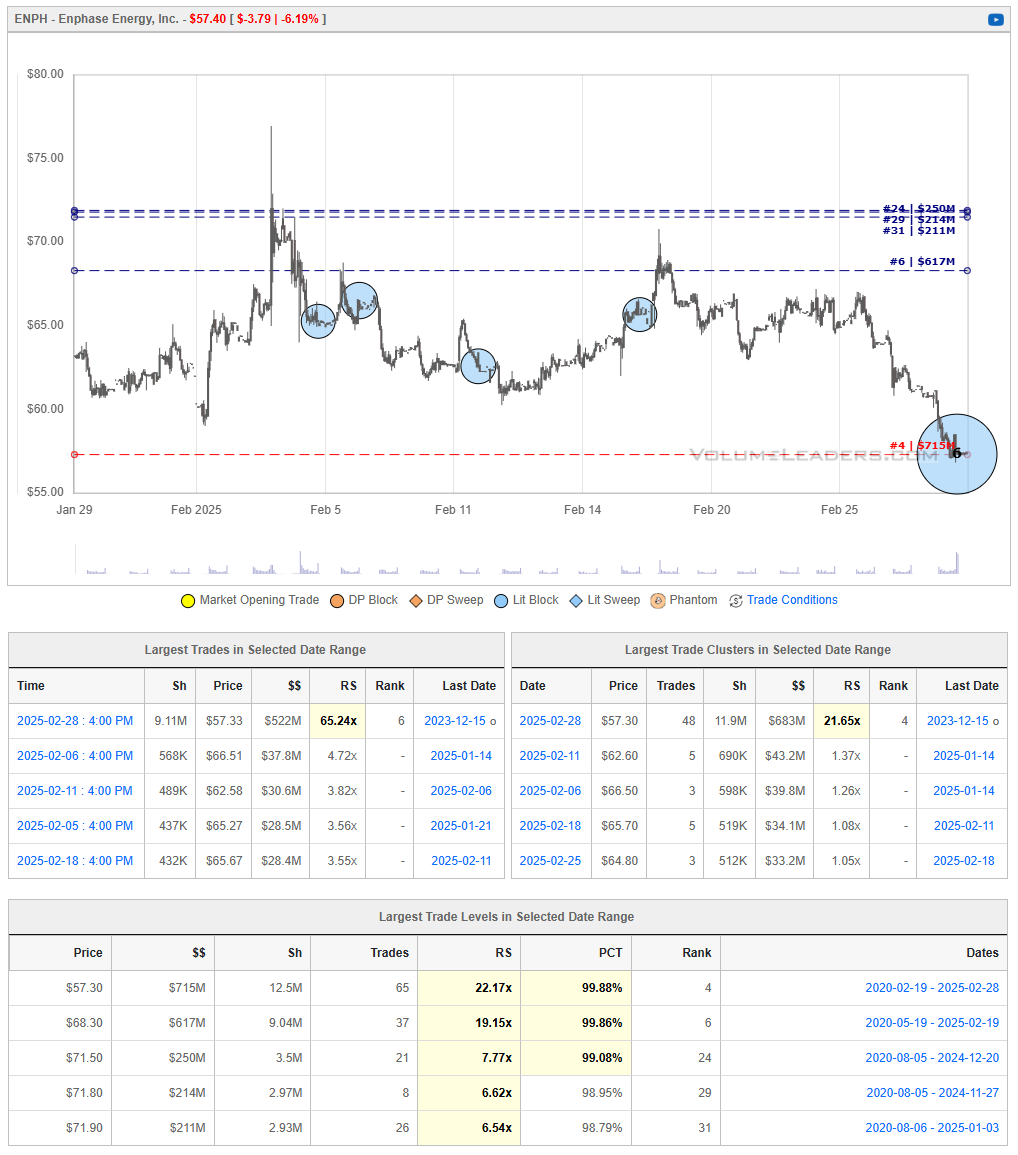
ENPH 0.00%↑
Enphase Energy Inc. (NASDAQ: ENPH) is a leading provider of solar energy solutions, specializing in microinverter technology that converts solar energy into usable electricity for residential and commercial use.
Bullish Perspective for Enphase Energy Inc. (NASDAQ: ENPH)
Leading Position in Microinverter Technology with Competitive Advantages
Enphase is a pioneer in microinverter technology, a critical component in solar energy systems that converts DC to AC electricity at the panel level, providing increased energy efficiency, reliability, and safety compared to traditional string inverters.
Unlike centralized inverters, Enphase’s microinverters enable panel-level optimization, meaning that shading or debris on one panel does not reduce the performance of an entire system. This gives Enphase a competitive edge over traditional inverter-based solutions, particularly in residential and small commercial solar installations.
The company’s IQ8 Microinverter series provides grid-independent solar energy storage, allowing users to generate power even during outages—a feature that many competitors, including SolarEdge, lack.
Resilient Revenue Growth Despite Industry Headwinds
Enphase has maintained strong revenue projections for Q1 2025, forecasting between $340 million and $380 million, surpassing Wall Street estimates of $338.5 million.
This outlook reflects solid demand for its new battery storage solutions and safe harbor revenue contributions, which allow U.S. customers to lock in tax incentives by pre-purchasing equipment.
Additionally, Enphase expects to ship between 150-170 megawatt hours of IQ Batteries in the quarter, indicating robust adoption of its energy storage products.
Strategic Market Expansion into Europe and Latin America
Enphase has aggressively expanded into Germany, Austria, Switzerland, and the Netherlands, capitalizing on Europe's push for decentralized, renewable energy systems.
Despite a temporary demand slowdown in Europe, Enphase sees the region as a long-term growth driver due to rising energy security concerns and government policies favoring residential solar.
The company has also expanded its IQ8 Microinverter distribution into Colombia, Panama, and Costa Rica, a move that strengthens its foothold in Latin America, where solar adoption is accelerating.
Battery Storage Market Penetration Strengthens Long-Term Potential
The global market for residential energy storage is booming, driven by high electricity prices, extreme weather events, and power grid instability.
Enphase has introduced the IQ Battery 5P with FlexPhase technology, which supports three-phase backup power solutions, a significant upgrade over prior models.
As solar-plus-storage adoption grows, Enphase is well-positioned to capture market share, offering an integrated energy ecosystem that competes directly with Tesla’s Powerwall and Generac’s PWRcell.
Strong Balance Sheet and Profitability Provide Stability
Enphase maintains healthy gross margins, which were 41.5% in Q4 2024, even amid an industry downturn, showcasing its ability to preserve profitability despite pricing pressures.
The company holds $1.25 billion in cash and equivalents and remains free-cash-flow positive, giving it the financial flexibility to invest in R&D, expand operations, and repurchase shares if necessary.
Bearish Perspective for Enphase Energy Inc. (NASDAQ: ENPH)
Steep Stock Price Decline Signals Weak Investor Confidence
Enphase’s stock has plummeted over 65% from its 2022 peak, making it one of the worst-performing solar stocks in the past 18 months.
Investors have fled solar stocks amid higher interest rates, as the cost of financing residential and commercial solar projects has surged, slowing adoption rates.
Despite a strong product lineup, Enphase's valuation remains under pressure, and without a clear catalyst for a turnaround, the stock could remain volatile in the near term.
Weakening Demand in Key European Markets
Enphase reported a 25% drop in European revenue in Q4 2024, attributing the slowdown to high inventory levels and softening consumer demand in the region.
The decline is significant because Europe has been a major growth driver for Enphase in recent years, and continued weakness could exacerbate revenue pressures moving forward.
Additionally, government subsidies in Europe for solar installations have been tapering off, meaning that demand may not rebound as quickly as investors hope.
Competition from Traditional Inverters and Emerging Technologies
While microinverters offer efficiency and safety advantages, traditional string inverters (such as those offered by SolarEdge and Huawei) remain dominant in larger-scale commercial and utility projects, which limits Enphase’s market share in this high-volume segment.
Some Chinese manufacturers have begun producing microinverter alternatives at lower costs, raising concerns about potential margin compression if price competition intensifies.
Regulatory Uncertainty and Solar Policy Risks
The solar industry heavily relies on government incentives, tax credits, and net metering policies, all of which can shift dramatically depending on political leadership.
In the U.S., net metering policies have been revised in multiple states, reducing the financial benefits of selling excess solar energy back to the grid.
If regulatory policies become less favorable toward solar adoption, it could slow installation rates and hurt demand for Enphase’s products.
Macroeconomic Headwinds and Higher Interest Rates Could Further Delay Solar Adoption
The residential solar market is sensitive to interest rate fluctuations, as many homeowners finance solar panel installations through loans.
With the Federal Reserve keeping interest rates higher for longer, financing costs for solar projects remain elevated, making it harder for consumers to justify upfront investments in solar systems.
If economic conditions deteriorate, residential solar demand could soften further, impacting Enphase’s growth prospects.
Conclusion
Enphase Energy remains a highly innovative leader in solar energy technology, with strong market positioning in microinverters, energy storage, and grid independence solutions. Its expansion into new markets, strong cash position, and increasing battery storage adoption make it an attractive long-term play in the renewable energy sector.
However, short-term headwinds, including declining European revenue, macroeconomic uncertainty, and policy risks, create challenges for the stock. With high interest rates slowing residential solar adoption and stock price volatility remaining high, investors may need to exercise patience until demand rebounds or interest rates decline.
For long-term investors, Enphase remains a compelling growth story in clean energy, but near-term risks should not be overlooked.
PDD 0.00%↑
PDD Holdings Inc. (NASDAQ: PDD) is a multinational commerce group that owns and operates a portfolio of businesses, including the prominent Chinese e-commerce platform Pinduoduo and the U.S.-based online marketplace Temu. The company focuses on integrating businesses and consumers into the digital economy, enhancing productivity and creating new opportunities for local communities and small enterprises.
Recent Developments:
Rebranding and Expansion: In February 2023, Pinduoduo Inc. rebranded as PDD Holdings Inc., reflecting its evolution into a global commerce group. This strategic shift underscores the company's commitment to expanding its international presence, notably through the rapid growth of Temu in markets like the United States and Europe.
Financial Performance: For the fiscal year ending December 31, 2023, PDD Holdings reported revenues of $34.98 billion, a significant increase from previous years, and a net income of $8.48 billion, highlighting robust profitability.
Bullish Perspective:
Innovative Business Model: Pinduoduo's unique approach combines social media elements with e-commerce, encouraging group buying and interactive shopping experiences. This model has resonated with consumers, leading to rapid user growth and high engagement levels.
Strong Financial Metrics: The company's impressive revenue and net income figures demonstrate effective cost management and scalability. Such financial strength provides a solid foundation for continued expansion and investment in new initiatives.
Global Expansion via Temu: The successful launch and growth of Temu in international markets indicate PDD Holdings' ability to adapt its business model beyond China, tapping into new consumer bases and diversifying revenue streams.
Bearish Perspective:
Intense Competition: PDD Holdings faces stiff competition from established e-commerce giants like Alibaba and JD.com in China, and from platforms like Amazon in international markets. Sustaining growth amidst such competition requires continuous innovation and significant investment.
Regulatory Challenges: Operating across multiple jurisdictions exposes PDD Holdings to varying regulatory environments. Changes in e-commerce regulations, data privacy laws, or trade policies could impact the company's operations and profitability.
Profitability Concerns: While the company has achieved substantial revenue growth, maintaining profitability, especially with aggressive pricing strategies and expansion costs, remains a challenge. Investors should monitor margins closely as the company scales.
In summary, PDD Holdings Inc. has demonstrated remarkable growth through its innovative e-commerce platforms and strategic global expansion. However, investors should consider the competitive landscape, regulatory risks, and the sustainability of its profitability when evaluating the company's future prospects
Summary Of Thematic Performance YTD
VolumeLeaders.com provides a lot of pre-built filters for thematics so that you can quickly dive into specific areas of the market. These performance overviews are provided here only for inspiration. Consider targeting leaders and/or laggards in the best and worst sectors, for example.
S&P By Sector
S&P By Industry
Commodities: Energy
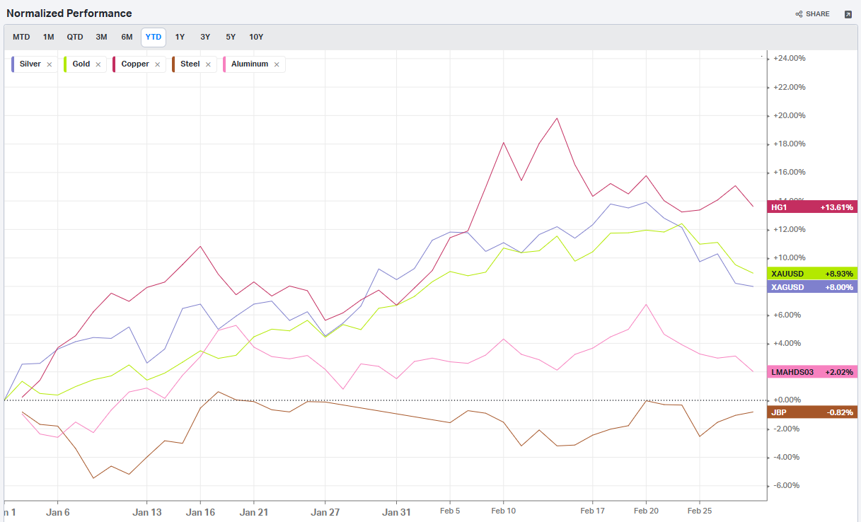
Commodities: Metals
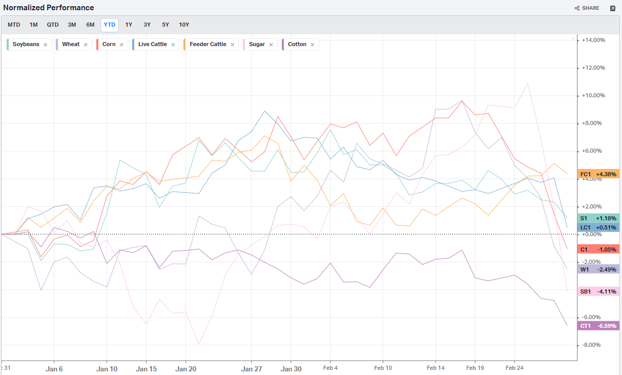
Commodities: Agriculture
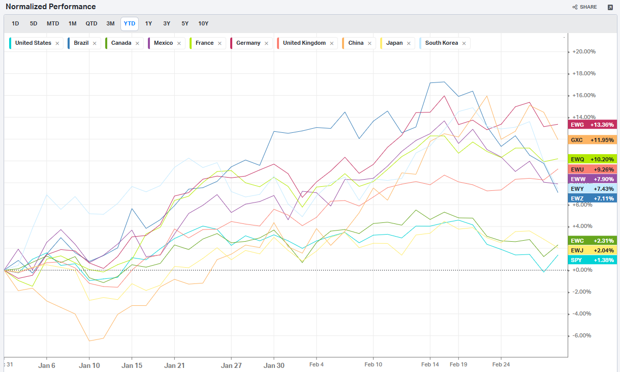
Country ETFs
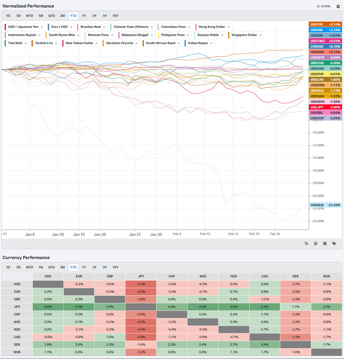
Currencies
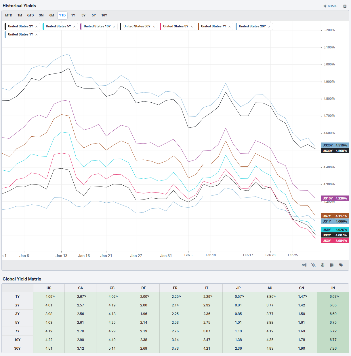
Global Yields
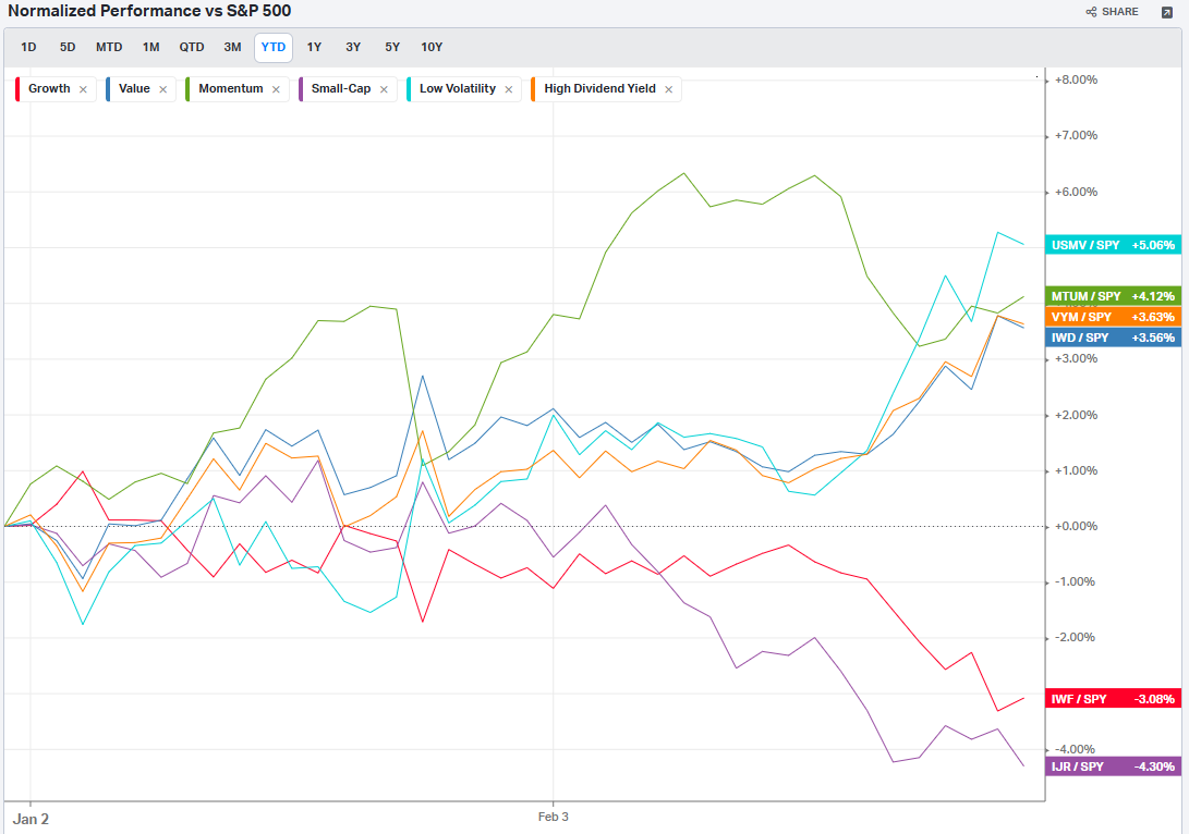
Factors: Style
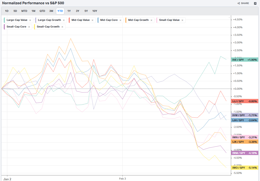
Factors: Size vs Value
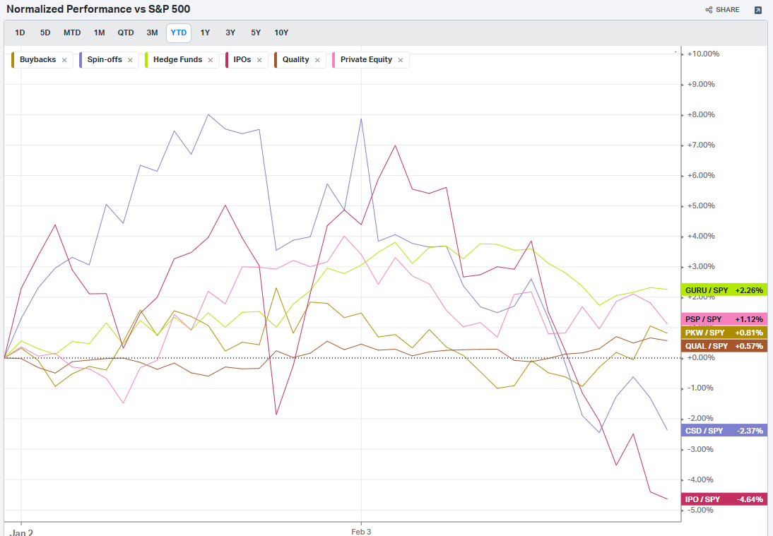
Factors: Qualitative
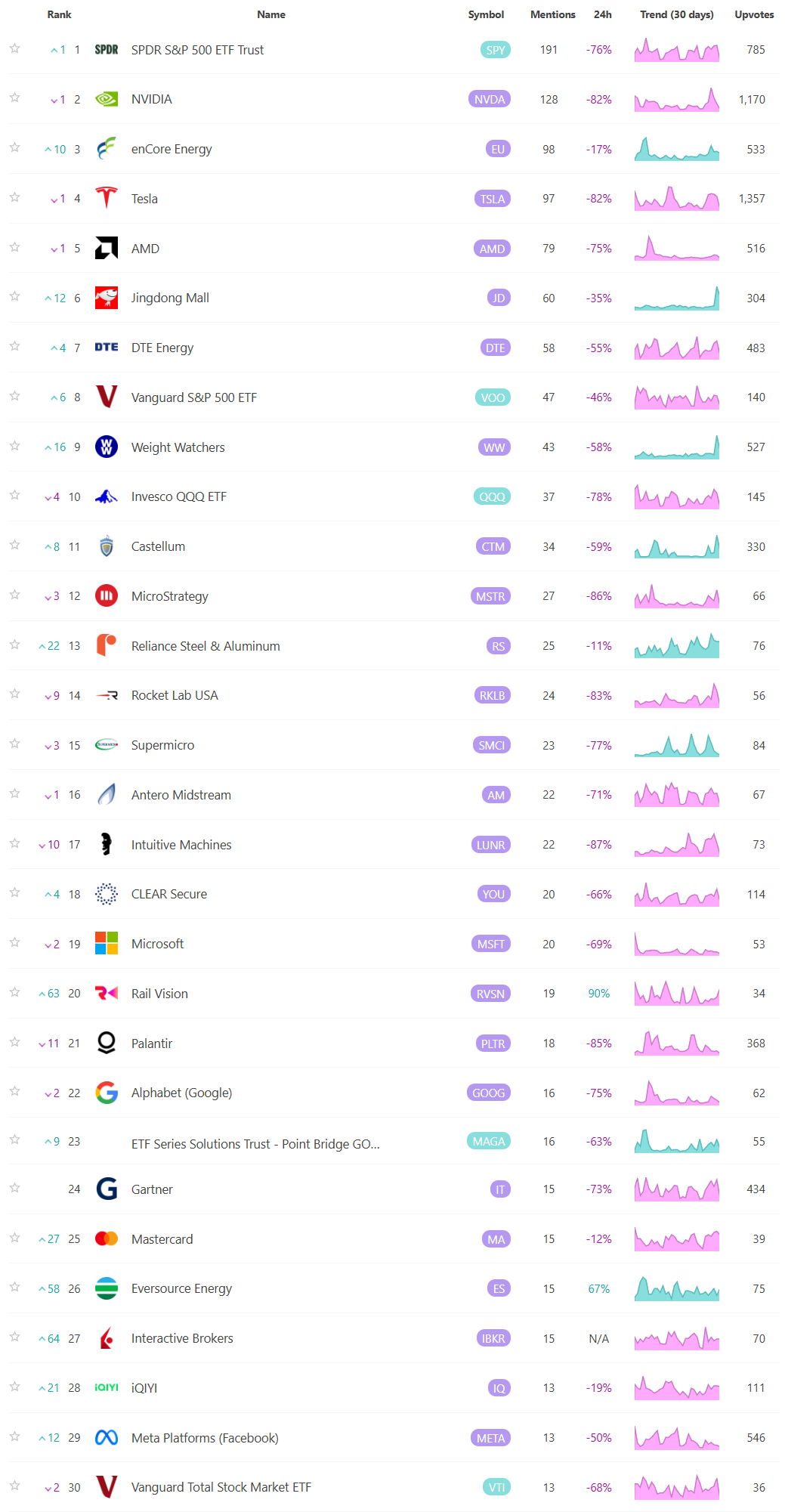
Social Media Favs
Analyzing social sentiment can provide valuable insights for investment strategies by offering a pulse on public perception, mood, and market sentiment that traditional financial indicators might not capture. Here’s how social sentiment analysis can enhance investment decisions:
Market Momentum: Positive or negative social sentiment can signal impending momentum shifts. When public opinion on a stock, sector, or asset class changes sharply, it can create buying or selling pressure, especially if that sentiment becomes widespread.
Early Detection of Trends: Social sentiment data can help investors spot trends before they show up in technical or fundamental data. For example, increased positive chatter around a particular company or sector might indicate growing interest or excitement, which could lead to price appreciation.
Gauge Retail Investor Impact: With the rise of retail investor platforms, collective sentiment on social media can lead to significant price movements (e.g., meme stocks). Understanding how retail investors view certain stocks can help in identifying high-volatility opportunities.
Event Reaction Monitoring: Social sentiment can provide real-time reactions to news events, product releases, or earnings reports. Investors can use this information to gauge market reaction quickly and adjust their strategies accordingly.
Complementing Quantitative Models: By adding a social sentiment layer to quantitative models, investors can enhance predictions. For example, a model that tracks historical price and volume data might perform even better when factoring in sentiment trends as a measure of market psychology.
Risk Management: Negative sentiment spikes can be a signal of potential downturns or increased volatility. By monitoring sentiment, investors might avoid or hedge against investments in companies experiencing a public relations crisis or facing negative perceptions.
Long-Term Sentiment Trends: Sustained sentiment trends, whether positive or negative, often mirror longer-term market cycles. Tracking sentiment trends over time can help identify shifts in investor psychology that could affect longer-term investments or sector rotations.
For these reasons, sentiment analysis, when combined with other tools, can provide a comprehensive view of both immediate market reactions and underlying investor attitudes, helping investors position themselves strategically across various time frames. Here are the most mentioned/discussed tickers on Reddit from some of the most active Subreddits for trading:
Events On Deck This Week
Here are key events happening this week that have the potential to cause outsized moves in the market or heightened short-term volatility.
Econ Events By Day of Week
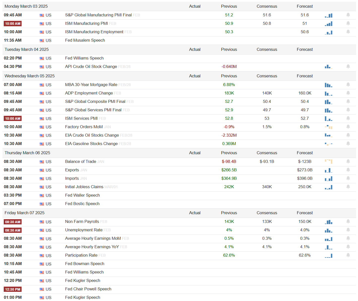
Anticipated Earnings By Day of Week
Thank you for being part of our community and for taking the time to read this publication. Your engagement and insights mean a great deal to all of us, and we're genuinely grateful to share this space with such dedicated and thoughtful readers. Wishing you a productive and successful week ahead in the markets. May the coming days bring clarity and great opportunities. Happy trading!